The Body Shop Brief.
After going through the brief in detail answering many different questions about what the brief is actually asking me to do. This meant that I was able to think about what I was actually suppose to do for the brief and more importantly what I could do. For The Body Shop brief I have to produce 4 A2 posters one for each of the products that have been given, White Musk, Body Butter, Colour Crush Lipstick and Nutriganics.
I started to look into each of the products and what I could do for them, I also looked into what I could do for my social campaign, but then thought that my campaign should be relevant for the posters.
After going through the brief I have decided that I am going to change my target audience to men rather than women. The Body Shop Brief suggests that they are "rule breakers" and "law changers" they also said that their target audience was for "women but not exclusively". Because of this I have decided that I am going to change the target audience. I think that this will get my entry noticed as it will be different to everyone else's as they will be targeting women. This allows me to try and challenge the brief, and change the way that Body Shop advertise and maybe increase sales by attracting a different target audience.
Researching advertising for men (see Design Context Blog) I found that men respond more to humour in advertising whereas women are more responsive to life and children related advertising but also react to other women and the feel of being envied.
Poster Development.
Coconut Body Butter.
I want to create posters which are primarily targeting men, and create simple illustrations for each of the posters which will relate to the products. But I also want the illustrations to be quite suggestive and cheeky to grab the attention of men.
I thought that using the body of a women and using coconuts as a bikini top would be quite suggestive. I then thought about the product that I could use this illustration with. The body butter would work really well with this illustration as it is showing a lot of skin which is where the body butter is used. Also there is a coconut flavour for the body butter so it will be relevant.
Keeping the colour scheme similar, I thought I would try and work on the actual poster aesthetic and what that would look like and what I would need to include on it.
I want to include a short piece of type that is witty and grabs attention, this will attract men if it is humorous and short. Having a main piece of text will catch the attention and then a smaller bit will make the consumers want to buy the product.
I think that having a coloured background makes the logo stand out more when its white, therefor if I keep all of my posters consistent and having them all with a coloured background and a white logo means that they will all work better as a set.
I'm not sure about whether or not I am able to use photographs of the actual products on the posters as they weren't provided in the brief pack. I also don't want to use anyone else's images of the product and that may breach copyright.
I think that it will work better if I create my own simple vector versions of each of the products, this means that it is all my own work and I wouldn't be breaching any copyright laws. Also I think that they would work better with my illustrations keeping them consistent with each other.
I also created the other simple illustrations for the other products so that when I design the posters for them they I will have already made them. Each of them have The Body Shop logo on them just so that it repeats the fact that they are The Body Shop products.
Layout experiments.
Trying to use the image for the product in the posters didn't look great so I decided to take it out of the layout so see if it looked better without one there at all. Although I think that adding the vector illustration of the product would be better. I also started to look into where I should place the type and what the type should be.
The two lots of type on the posters in my opinion doesn't look right. I think that it might be more clear if there is one piece of large text will be enough. Trying out the 'coconut body butter. it will change your life' meant that I was including the product in the type, but it wasn't very humorous like I wanted it to be. Therefore I think that it would be better if I use the original type 'check out them coconuts.' its witty and short which is what I was going for.
Although I like the poster being really simple and minimal, I also think that there should be some information about the product on the poster. The Body Shop often put a short description of their products the bottom of things along with an image of the product. This is why I thought that putting the illustration of the coconut butter and the short description of the product on the bottom.
Drops of Youth.
Drops of youth is a cream that moisterises the skin and apparently prevents aging skin. When I think of aging skin, I think of eyes and crows feet by the eyes. Therefore it would be suitable if I used an eye for the illustration.
I thought that drawing a simple blue eye would be suitable for the illustration, then I could accompany it with a cheeky piece of type. It could be like the poster is 'giving you the eye'. Although I think that the eye look a bit flat and more shading might need to be added to it.
Adding more detail to the iris, the creases in the eye and the shadow around the eye means that it look more realistic and will connect with the audience more.
Layout experiments.
'Men age well. Women need help.' I decided to use this as men will find it funny and may make them want to buy the product. Also, because the illustration is quite tame, I thought that the type could be more suggestive.
With the body butter poster, I decided that I was going to use a description of the product on the bottom, so I think that I should keep them consistent and have a description on all of them.
I think that the left aligned type is more appropriate for the posters. Also the vector image is necessary to go onto the posters so that it is clear what the products look like. As if a man goes into The Body Shop looking for the product they will need to know what it looks like.
Colour Crush Lipstick.
Lips are quite a seductive part of the body, as men react to humorous and sexualised advertising, lips would be fitting with this set of posters.
When creating the illustration of the lips, I wanted them to look glossy and like they were wearing the lipstick, therefore I used to same colour on the lips as I did for creating the illustration for the lipstick.
Trying to put the lipstick next to the lips makes the lips look like they have just used the lipstick, although there should definitely be a description and the product on the posters, so neither of these posters would work.
I also tried to separate the lips and the text into different sections, like I have in the other posters. But instead of accentuating the different elements, it just separates them and makes you read all the parts separately when they should all read together. The combination of the illustration, type, product, and product information works really well together on the right.
The lipstick fit really well next to 'make her lips ravishing.' and also followed the grid system I have used well. Although I think that the product should be next to the product detail, in keeping with the other posters.
Boards for crit.
For the Final Crit for our big main brief I had only finished 3 of my 4 posters and not done my campaign or interactive yet. My main feedback I received was that I should consider making my lips and eyes more seductive and suggestive. After the crit I decided that I would change the lips and eyes to make them work better with my other poster.
I started my making the mouth look as if it were slightly more open, which makes it look a bit more seductive.
But I thought that I should add something to make it look more seductive. I think that the tongue makes it more cheeky, and is more fitting to my posters.
For the eyes I think that if it winks it will make it look more suggestive, it will also look like the poster is winking at the consumers.
Although it looks a bit odd without a nose there. Therefore I decided to add a shadow where the nose would be to make it look more life like.
These are the three amended posters with the new illustrations. The crit was very useful as it meant that I could change the illustrations, and I am happier with them now. Also in the crit, Sam questioned the typeface I chose. When designing this I used Bebas, and I didn't even think to check to see if it was a commercial font, and it wasn't. I changed it to Helvetica.
White Musk.
For the White Musk illustration, I was trying to think about places where you spray perfume, and I thought the wrist and the neck are the main places most people think of. I think that the neck would be the easiest place to make look suggestive and sensual.
My initial illustration that I have done is very detailed so that the viewer will be able to see the contours in the neck, and makes it look less flat. Although I think that there is a bit too much detail in the illustration, as there is minimal detail on the other illustrations.
I have removed some of the detail on the neck, but I still think that there is a bit too much detail, and I think that there would be less colours used, maybe get rid of the white parts.
Getting rid of the white bits looks a lot better although I still think that its slightly too detailed and not very life like.
This illustration looks much better, changing the colours so that they are less harsh on each other. I also changed the opacity, which made the colours less harsh too. Bare skin is suggestive in any way, although on a neck makes people think in a seductive way, which is fitting with the rest of the posters.
For the layout of this poster, I didn't need to do any variations as I am going to use the same layout and grid system as the other three posters. After the crit I found that this is the best way to lay the posters out, therefore I am going to move forward with this layout.
Final Posters.
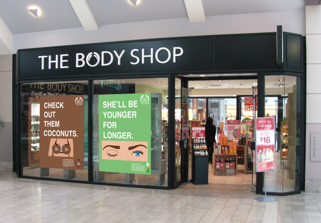
These are the final posters that I will be submitting for The Body Shop competition. I decided to change the type on the Drops of Youth poster to say 'She'll be younger for longer' I did this because I think that 'Men ages well. Women need help.' is a bit too offensive and sexist. I think that I have pushed the brief a bit anyway, and I don't want to take it too far that it is offensive. I went through all of the posters and re-gridded them so that all of the illustration occupy the same height as each other, also the type starts in the same place and the logo is in the same place. As although I did use a grid system, I found that each of them had their own grid, and they should all have the same, if I want them to all look consistent.
The writing on the posters.
I have used the description of each of the products that The Body Shop have used on their website, although I have adapted them slightly so that they relate with each of the products.
Mock ups.
The messages will be displayed in-store in the window display. The idea of the campaign is to drive men into the store to buy gifts for their female relations. Changing the target audience to men rather than women will communicate to a new and different target audience for Body Shop.


No comments:
Post a Comment