Wednesday 30 October 2013

Web Workshop 3

The Workshop;
In this workshop we were working on the concept of our websites, what we are wanting to achieve and what content we are going to put on  the website. We started by making lists about what is going on the website, and what links would be coming off each things.

The first diagram I have done was very confusing and hard to follow, the lists I made were very cluttered with arrows therefore I will have to redo this diagram to make it more clear. I decided to go from my home page to occasions rather than going to products, this is because of the session I did the other day, it made it clear in my head what I should be doing on my website and what my content should be.

I decided to draw up more of a mind map of my pages, something that would make it more clear, as it is currently confusing in my mind and on paper. After thinking about whet everything will be linked to, I need to consider what will be on each page, and whether they will link together. For example the Cards will all link together, and all of the Ribbons will link together.

As my website idea is a lot clearer, I decided to write what my actual content will be, as I will be hand making all the cards, and products myself, I needed to think about what will be written in the description and things below the product. I have looked into what other sites have written for their descriptions and found that I should write it all down so I could have a clearer mind.

Some of the content;
  • Description
  • Delivery
  • Return
  • Occasion
  • Product code
  • Ask the seller?
  • How to make?
  • Quantity
  • Dimensions
  • Materials
We then drew up homepages, something that will incorporate the work that we have done in this session. Drawing up a mock of a homepage and allowing people to crit it will give me feedback on my ideas so that I can improve them. I tried to label my work thoroughly so that when people were criting my mock, they can see why I was doing what I was doing.

The Feedback;
  • Very well thought out design, good aesthetics and looks informative.
  • Like the rotating panel of card designs, you've kept the theme consistent, good interaction with the audience with the 'how to make'.
  • Does the 'how to make' section need to be on the home page or can it be in a separate section of the website? Overall the design is interesting, but I feel like it might look a little cluttered with the drop down menus.
  • Very straight forward concept but design is too blocky and to a level simple. Try something a little less corporate!
Of the four pieces of feedback I got from my homepage mock, I found that a coupe of them are really helpful, and have given me something to think about. 'Try something a little less corporate' is something I will bare in mind, although I want my website to be quite simple I also want it to be effective, therefore don't want it to be too cluttered, and also more creative as it is for hand crafted things. Also the comment about the 'how to make' I thought about having it on a separate page, but this isn't my final design, I still don't know exactly where everything is going to go, although after this feedback I think that it might be better if I had a separate page. This feedback is very helpful, and I can now adapt my ideas, so that it is more presentable and appropriate, also adapt it so that the website will be successful.

Creative Suit Session 2: Photoshop

Photoshop;
Every image has a mode, you can find the mode of any image on Photoshop by going to image then to mode, this is also how you change the mode.
Also you can set the colour mode when you are opening a new document, the option is on there.
The default mode for Photoshop is RGB. If you change the mode to CMYK it will lose some of the options available, this is because Photoshops settings were made with RGB in mind.
Many of the RGB colours sit out side the range of the CMYK palette therefore the colour may shift into a different colour, although it is the closest colour to it.

Colour Modes;
If you apply a gamut warning to the image you want to print it will show you what you can and can not print.
You can go to adjustments, hue and saturation to change how much grey is on the image, this will change the colour so that it is more suitable for printing, this is so that you can bring the colours back into the range of CMYK.

Adjusting the hue and saturation is the best way to do this, as it allows you to have control over the colours.

If you go to View and then click proof colours it will show you the image in CMYK whilst still working in RGB, this makes sure that you can see what it will look like when its printed, but it means that it also can work in RGB which is Photoshops preferred mode.

When you save your image make sure you save it in CMYK mode.

Swatch's;
For us to work with consistent colour, you need to work with a swatch palette. Photoshop is very similar to Illustrator in this way, there is a swatch palette with all the default swatches in it. To delete swatches on Photoshop, you need to click alt and click the swatch you want to get rid of.
When you are choosing your colour in Photoshop you need to make sure that your colour is available in CMYK, you can see this by looking at the little boxes next to the colour.

If your colour isn't available in CMYK a little box will appear with a warning triangle on the top. To get around this you just have to click on the warning box and it will take you to the nearest colour available to you.

Using spot colours in Photoshop;
when you are choosing your colour in the colour picker, there is a colour library which you should click on.
Just change the Book into what you want to work in, then just type what you want to find, and you will find your colour and it will come up in the foreground colour.

Using spot colours in this way makes the colour on the image into CMYK as it can only work with one colour mode at a time, therefore it is no longer a spot colour.

This process is only available when you are working with a greyscale image.

To change the colour of your image wen it is in greyscale you have to bring up the duotone options, this allows you to select a spot colour to use instead of a black plate.
Exchanging the black ink for a spot colour means that this will print as a spot colour, this is evedent as the reference number is there and available for the printer to use. This is on the monotone setting.


Creating a duotone option means that both colours will be printed as spot colours, they will be overlayed in the printing process.


Allows you to map your spot ink to the origional shade of grey in the origional image. You can do this by clicking on the diagonal line and adapting it.

Changing the direction of the diagonal line means that what was 100% white in the image is now 100% green. This is a really good technique to use, it looks really good. Even after you have saved the image, you can still go back and adapt and tweek the image, by simply clicking on the spot colour and changing it.

 In RGB mode, the channels will show you each of the separate plates used to create this image.

The channels are always shown separately in greyscale. This is Red, from RGB.

Opening a greayscale version of the lake, it only has one channel as it is greyscale, therefore to add a spot colour you go to options then new spot colour.

Choose the colour that you want your new spot channel to be.

After creating a spot channel, you can see the colour that has been applied with a paintbrush, to can paint with white if you want to get rid of some of the bits you have painted in, you do this by holding 'x'.

The channel itself looks like this, as it is representing the spot colour in greyscale.]

If you make the colour grey rather than black it will show you an opacity of the spot colour you have chosen. Also if you select a certain area then create a new spot colour and it will turn all of the area that you have selected that spot colour.

You can also add type to to the image if you want to, and it looks like this.

All inks are transparent, you can work with different transparency of inks, so changing the solidity simulates the opacity of a colour, if you change the solidity to 100% it will be completely opaque.

Tuesday 29 October 2013

Web Workshop 2

The Session;
During this workshop we started by working in groups discussing different questions, then opened it up the the entire class, so we could find more information and find out what people thought. I found in this workshop, I don't know a lot about web design at all, therefore this was a good way for me to learn more.

What are the common conventions of navigation?
  • Homepage
  • Links
  • Menu bar - left hand side
  • Scrolling
  • Search bar
  • Drop down bar
  • Facebook/Twitter links - social networking
  • Logo/name
  • Home button
  • Breadcrumbs - extra links
  • Auto updates - intuitive to the user
  • Navigation indicators
What are uncommon conventions of navigation?
  • Type to search - designspiration
  • Menu at right side or bottom
  • Holding page
  • Scrolling - no link involved
  • Eye tracker
  • 3D view
  • Voice
  • Disappearing menu bar
  • Landing pages
  • Dynamic content scrolling
We then moved onto applying these to diagrams and flow charts linked to our web design subject.
Flow Diagram - "Schematic representation of a process which can give a step by step solution to a given problem. We started to make our own flow diagrams;

When I started to make my first flow diagram, I went with my first idea, the idea that I thought I wanted to do, the idea I used for my scamps for the web session with Simon. Although when I started to link the pages together I realised that they all link to each other, and I became aware that I was thinking about this the wrong way. I should be looking at the occasions rather than the products.

After deciding this I thought that I would approach the flow diagram in a different way, I went for using my 5 pages as, home, birthdays, valentines day, Christmas and mother/fathers day. This allows me to think of my web design brief in a different way, and allows me to produce less products but still have a large content for my website.

We then took the five different websites we chose and found the grid in them;


Scampts for Web Design Session

Scamps;
We made some scamps for our websites, what we thoguht our website was going to look lie, I want to keep mine simple, yet effective, this is what I have gone for with my scamps.
 

I designed these scamps after my first web session, since then I have changed the way I want my website to look, as I no longer am going to have the products on the homepage, I am going to organise my website through occasions instead, as I think it would work better and would be more appropriate. We all went round each others scamps and wrote our feedback on some of them, this is so that we can improve our scamps.

Feedback;
  • Navigation should remain consistent and visible through all of the pages, also make sure it is easy to locate. Want to be playful and create something unique although don't want it to be not productive and accessible.
  • First one would work best with grid, its most understandable and aesthetically organised but third one will probably be best for useability, maybe try and mix one and three.
Although my idea has slightly changed for how I wanted to present my information, I still think that this process and the feedback I got was helpful, as it gives me a good insight as to what idea I should use for my website design.

Web Design Session 2

The Session;
1024 x 768 will work on 94% of devices currently in use to get onto the internet.

Try and limit yourself to only working with two fonts, one for the headings and the navigation buttons, then one for body copy.

We are now going to create the website template on dreamweaver.
First we are going to create the outside box. The naming conventions for this is the container or wrapper. To do this we are going to create the container in the style sheet.

Anything with the /* */ means that it can just be a personal note to yourself, it doesn't effect the website, although can be seen if you look through the coding for the website.

It is better to have different variables on different lines.

Putting a semi colon on the end of the height or width will close the variable, then just add a } to close the bracket.
opening the div id on the source code, this is in the body so that it can be seen. then to close the div id, you do the same just before the body is closed.

As you cant see if it has worked as it is just a container, you can add a background colour on the spreadsheet, and choose any colour.

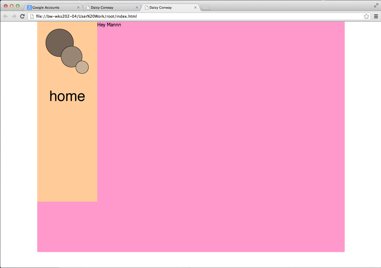
Choosing pink as my colour meant that after I have saved it went onto my site to see it live, and it showed me the pink site with my works on it.
If we worked with fixed positioning it would eliminate the white boarder around the outside, you can you can also work with relative positioning, this is so that it can just floats, and cant go over the top, the third way is absolute, which is a lot like fixed.


Making the coloured screen get rid of the lining you can go on position, change the top and left to 0 this is so that it has no board.

Although if you want to positioning to be in the center of the web page you can change the 'left' to 50, this makes the left edge central not the whole thing central.

It is better to do it this way rather that just changing the left into 25% as it won't be consistent on all screen or if you change the size of the screens, this is a better way to do it by creating a margin to the left.

Next we are creating the navigation bar.
First on the spreadsheet you need to div the same sort of thing as before, #nav, the do the height and width, add a background colour so that you can see it on the website, then position it, this time using  a float.
Then go to source code and after container add the div, nav, then close the div, this will make the colour available to see on the website.

After saving the Dreamweaver document and opening it on chrome I can see what effect this gives, it worked, although I don't think that the colours look great.

We are now creating the buttons, working with CSS means that we can just creat one for all four, although if we work with HTML we would have to create all four.
Going on illustrator to create a logo, to do this I need to change the profile to web, then change the pixels to 200 x 200 pixels, as this is the size I want it on my website. Also when you are saving an image, go on save for web, then change the Name that you are saving it to PNG-24 this means that it will save with a good clarity, also make sure transparency so that the background colour isn't in it.

To then get the logo onto the spreadsheet and do the same kind of things to it again, apart from this time go onto background then image, and you will be able to find the logo we just saved from illustrator.
Then go to the source code and add the logo as the next div, then save it again, and view it on chrome.

After viewing my page, I found that my logo was there, although the colours are horrible and don't work together at all, it worked, that's all that matters.


Don't reply on dreamweaver to preview your website as it cuts off a lot of it and doesn't look the same as it does live, therefore always check on the internet on something like safari or chrome.

To put tabs into your source code you just use the tab button, you do this to see where you have opened and closed certain divs, this makes it clearer and easier for you to understand.

To do the button we just have to specify the area, and we will add the image into it after, this is because it is a rollover and we need to add it as a HTML not CSS.

To add the Image into the source code as a HTML you have to go to insert then image objects then rollover image, then it comes into this box below.


Then fill in all of the different fields.

Applying them and saving them allowed me to view the website, and this is what happened, the top image is before I hovered over the home button, and the bottom image is after I have hovered over the home button.