Photoshop;
Every image has a mode, you can find the mode of any image on Photoshop by going to image then to mode, this is also how you change the mode.
Also you can set the colour mode when you are opening a new document, the option is on there.
The default mode for Photoshop is RGB. If you change the mode to CMYK it will lose some of the options available, this is because Photoshops settings were made with RGB in mind.
Many of the RGB colours sit out side the range of the CMYK palette therefore the colour may shift into a different colour, although it is the closest colour to it.
Colour Modes;
If you apply a gamut warning to the image you want to print it will show you what you can and can not print.
You can go to adjustments, hue and saturation to change how much grey is on the image, this will change the colour so that it is more suitable for printing, this is so that you can bring the colours back into the range of CMYK.
Adjusting the hue and saturation is the best way to do this, as it allows you to have control over the colours.
If you go to View and then click proof colours it will show you the image in CMYK whilst still working in RGB, this makes sure that you can see what it will look like when its printed, but it means that it also can work in RGB which is Photoshops preferred mode.
When you save your image make sure you save it in CMYK mode.
Swatch's;
For us to work with consistent colour, you need to work with a swatch palette. Photoshop is very similar to Illustrator in this way, there is a swatch palette with all the default swatches in it. To delete swatches on Photoshop, you need to click alt and click the swatch you want to get rid of.
When you are choosing your colour in Photoshop you need to make sure that your colour is available in CMYK, you can see this by looking at the little boxes next to the colour.
If your colour isn't available in CMYK a little box will appear with a warning triangle on the top. To get around this you just have to click on the warning box and it will take you to the nearest colour available to you.
Using spot colours in Photoshop;
when you are choosing your colour in the colour picker, there is a colour library which you should click on.
Just change the Book into what you want to work in, then just type what you want to find, and you will find your colour and it will come up in the foreground colour.
Using spot colours in this way makes the colour on the image into CMYK as it can only work with one colour mode at a time, therefore it is no longer a spot colour.
This process is only available when you are working with a greyscale image.
To change the colour of your image wen it is in greyscale you have to bring up the duotone options, this allows you to select a spot colour to use instead of a black plate.
Exchanging the black ink for a spot colour means that this will print as a spot colour, this is evedent as the reference number is there and available for the printer to use. This is on the monotone setting.
Creating a duotone option means that both colours will be printed as spot colours, they will be overlayed in the printing process.
Allows you to map your spot ink to the origional shade of grey in the origional image. You can do this by clicking on the diagonal line and adapting it.
Changing the direction of the diagonal line means that what was 100% white in the image is now 100% green. This is a really good technique to use, it looks really good. Even after you have saved the image, you can still go back and adapt and tweek the image, by simply clicking on the spot colour and changing it.
In RGB mode, the channels will show you each of the separate plates used to create this image.
The channels are always shown separately in greyscale. This is Red, from RGB.
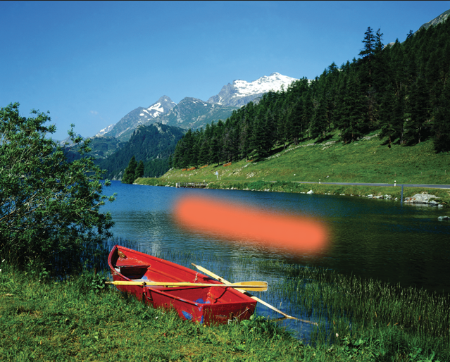
Opening a greayscale version of the lake, it only has one channel as it is greyscale, therefore to add a spot colour you go to options then new spot colour.
Choose the colour that you want your new spot channel to be.
After creating a spot channel, you can see the colour that has been applied with a paintbrush, to can paint with white if you want to get rid of some of the bits you have painted in, you do this by holding 'x'.
The channel itself looks like this, as it is representing the spot colour in greyscale.]
If you make the colour grey rather than black it will show you an opacity of the spot colour you have chosen. Also if you select a certain area then create a new spot colour and it will turn all of the area that you have selected that spot colour.
You can also add type to to the image if you want to, and it looks like this.
All inks are transparent, you can work with different transparency of inks, so changing the solidity simulates the opacity of a colour, if you change the solidity to 100% it will be completely opaque.


No comments:
Post a Comment