Project proposal;
When looking through all of my lecture notes and looking back into my essay I decided that the Farrow CD design was very interesting, it it creative packaging, which was very popular, and people started to buy it simply because of the packaging rather than the CD's themself. I wanted to consider the relationship between the packaging used on a product and the tone of voice it had, also who the target audience should be.
After the first crit;
After attending the first crit I decided that I would look further into a specific brand rather than looking for creative packaging in general. I found Cadbury's on google images, and saw that there were multiple different ranges of design for its packaging through time. Therefore I thought that I would look further into this.
Initial ideas;
My initial ideas were to produce a small kit or publication with information in it, inside packaging which was shaped like a large Cadbury bar.
I also started to do some thumbnails to get my initial ideas down, although after doing a small amount of thumbnails I found that I would be better developing my ideas digitally. I started to work on the idea of having a publication aimed at both adults and children, as Cadbury is enjoyed by everyone. I wanted to stick to the idea of keeping my publication simple and minimal, having pure information and images/illustrations.
Digital development;
Having one page plane and the other purple would be good for the publication as they are the Cadbury colours, keeping the design to just three colours allows the publication to be simple and be aesthetically pleasing, and not being too busy. Having just the date of when something happened in Cadbury's on one page, using negative space, then the information on the other side also keeps the publication minimal.
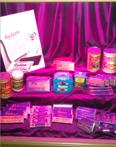
I started to look into what happened through time in Cadbury, and found many different events, I decided that it may look better if there was more going on in the publication, as children wouldn't be interested in the boring pages, and boring writing.
I started to look at the major things which happened in Cadbury, finding which businesses came in and out of Cadbury's, also I started to look at the adverts and how they have influenced peoples life and how they do this.
After the presentation;
I started to look further into Cabury's, looking through the website I found this illustration of Cabury World, then started to think about the website and how it is all presented. Even though Cadbury World is a fun day out for adults as well as children
I went to Cadbury World to collect some primary research and found that everything you do and everywhere you go, you find that Cadbury are trying to get you involved. When listening to the presentations about the history of the Cadbury sons, the chairs started rocking and air burst out of the back of the seats, this was an amazing experience, it really made the information more interesting and gets you involved.
After going to Cadbury World and seeing everything being brought to life, I thought that I would have to change my publication and make it a little bit more exciting. I want to still keep it simple, but just a bit more decorative. I am influenced a lot by the products that Cadbury made, for example the Mr and Mrs Chuckle Beans and the way that they are packaged, the colours used and the detail in it.
I started to think about stock and how I was going to print. I found a colour match for the Cadbury's Dairy Milk bar and thought that this colour automatically reminds people of Cadbury's therefore I should be using something which is recognisable to the brand itself.
I also started to look at which typeface to use, so I went on font book and typed in some words and numbers so that I could see if it suited the publication and the style I wanted to work in.
I found four different fonts, and decided that it was between the top two, either Modern No. 20 or Lucinda Calligraphy, both of which I like, but as I was thinking about doing a timeline and having lots of numbers I thought that I preferred the glyphs in Modern No. 20, I think that it looks more sophisticated, and suits my target audience and the brief, therefore I will use this and use Times for my body copy as I want to stick with my serif fonts.


I started to look at printing on the purple and printing on bulky newsprint, both looked very different. I tried to see the range of colours that I could get on the purple paper, and found that there weren't very many other than black and browns, although the browns didn't look very deep. I also decided to print purple with brown Cadbury's on the bulky newsprint to see how deep the purple was, and see if there was a colour match. |I found that although the colours weren't very clear on the purple, it looked a lot better than the purple on the bulky newsprint.
When experimenting with the gold I realised that it adds a great effect, it brings the page to life, and gives it something. I also started to look at different patterns which I could have in the background of my publication, and the gold would add detail to this too.
I started to look at the layout of the document and decided that I still want to keep it in the same format as I previously had it, so that it is the same size as a large Cadbury Dairy Milk bar. I think that this works well as it shows a relationship between the publication and the product. It is also important that it is the shape of the Cabury bar so that I will be able to package it later.
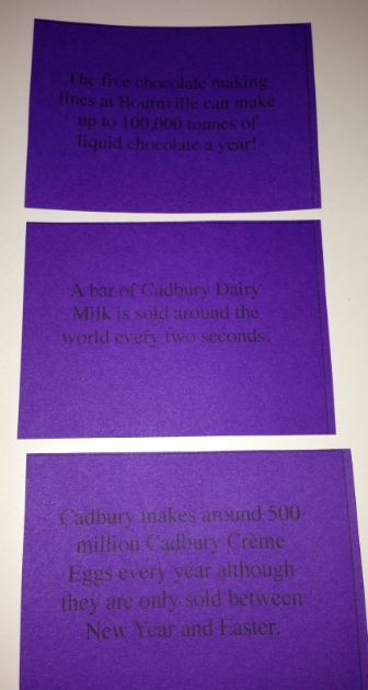
Before I started to create the actual publication, I decided to group all my information and write my body copy, so that when I start to design I will just be able to place my text, I will also be able to see how much text I have, so that I can organise the page efficiently. When going through my research I found lots of interesting facts I had collected, and thought that I would make some little info cards for people who read the publication to take out and read. I created a few different templates for the back of each card and decided that I would use all of them, instead of just selecting one.
As my publication Is purple, gold and black, I decided that these small envelops would be appropriate to use. As I'm not sure what my publication will end up like yet, I'm not sure where this will go, but hopefully will find a place to stick it in. The contrast between the black and purple works really well, it makes you want to look inside the envelope.
This is one of the patterns which I used, after producing it I decided that I really like it and it looks interesting. Therefore I will use it in my publication, maybe as the cover or the back of my publication, as it looks really effective with the gold on it.
When making the pages and doing the layout for the publication I found that because a lot of my images are from the past therefore I couldn't source them myself, I found that a lot of my images weren't my own, I had very few that I took myself. Therefore I decided to replace some of the images with my own illustrations.
When doing the illustrations I decided to only use the illustrations of the more modern chocolate bar designs and things that are around today, this is because everyone will know what they look like right now, therefore it doesn't have to include all of the details on the packaging. Also I want to show an accurate example of what the adverts and chocolate used to look like. I think having a mixture or images and illustrations is a good balance in my publication.
I wanted to have a consistent pattern and theme that ran through my book, and started to play with the pen tool on illustrator and found that what I created would be appropriate for my publication. This is a good way to add detail to my text without it looking tacky and overly cluttered.
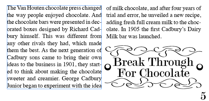
With this I wanted to break up the body copy as I thought that there would be too much body copy on one single page if I didn't although it is not relevant to have an image there so I thought that I would put 'Break Through For Chocolate' this illustrates the page and breaks down the body copy, which makes the page more interesting.
Printing and binding;
When printing out my publication I had to print the images and the rest of it off separate, this is because images wouldn't print onto the purple therefore I had to print them out separately on two different stocks, so that it would get a better effect.
As I am printing on purple paper, I am unable to print images, this is why I decided that I should print the images and illustrations out on normal print paper. This is because the paper is very thin, therefore when you stick it down in the book, there won't be thick stuck on images.
I bought some scratch and sniff stickers, as when I went to Cadbury World, I found that they are always trying to get the customers and audience involved, this is what made the trip so good. Therefore I thought that I could get some scratch and sniff sticker for my publication so that people would be able to smell chocolate as they are reading my publication, as it they are eating chocolate.
As my original idea was packaging and I still wanted to go in that direction, I decided to create the original Dairy Milk bar, this will show that I am taking my theoretical skills and producing something from it. I printed this on antique white paper, this is because the packaging is a slight pink, which will not print on a dark stock. The packaging it easy to get on and off therefore there is nothing to worry about when trying to open my publication.
My final publication;
Evaluation;
During this brief I have leanrt a lot about Cadbury's and how it has become what it is today. If I were to do this brief again I may consider making the packaging for all of the 14 different Dairy Milk designs which I have shown in my publication. I think that this would show a further understanding of how I understand Cadbury's and how it has changed in time.
I would also consider using a different stock, as although the purple is a good colour match for Cadbury, it doesn't print and light colours on it therefore I had to print the image on normal print paper. Next time I would consider using a different stock. I would also consider the experimenting with the most appropriate way to bind my publication, as I only tried one.