Friday 30 November 2012

Printed Text and Reading

First we were put into groups then given a word/words as our initial research word. We then got into groups to break down the words we were given and decided on which category each person should go for. Our group got the words 'Printed Text and Reading' and we came up with many different possibilities of the different categories we could get from these words.
Working in groups is hard as there is a lot of clashes with opinions, even though it was a minor task, some people wanted a certain direction which someone else had, therefore it would be easier to do it on your own, although this means that there would be less research collected. I got the direction of Branding and Identity in Printed Text and Reading, and then researched it a lot, to see this go to my Design Context Blog.

 Layout of posters;
After collecting all of my research, Primary and Secondary, I had to think about how I am going to present the information, so started to experiment with different layouts.

This looks a bit confusing and busy, there is no structure and it doesn't work very well as there is no distinction between the catagories, they just mix together. I could improve this by using a line to define where one category stops and another continues.

Trying to squash everything I wanted to be in the poster in it, doesn't look very good, it is too cluttered and doesn't look very professional and the information is scattered around, all next to each other yet different sizes.
I thought by changing the colours of inside the information boxes, it may balance the layout more, although I think the colour just makes it more confusing and I need to make it more simple and readable, especially as my original word is Printed Text and Reading, therefore it has to be readable.

I have made the layout more simple, all of the categories have the same structure to them, and taking away a lot of the examples and information makes the research posters appropriate and clear. Keeping both the primary and the secondary the same, using the same layout and theme, but then for my direction poster I will have the key word in the middle and visual research and examples surrounding it.

Secondary Research;
Through my initial research I decided that I found it more interesting to look at the brands and logos which are clever and humorous, which use negative space to play with the idea of the meaning of the company with the name of the company, also the layout of the text on the branding to show information about the company and the brand.

Primary Research;
Finding primary research of hidden meaning logo's and the layout of the text in branding is more difficult than finding secondary research. Although it is a very popular way of branding by putting hidden meanings into the logo, they are hard to locate.

Direction;
The direction I have chosen for my research for Branding and Identity in Printed Text and Reading is the way that people read logo's. Reading a logo should be easy and simple, even the hidden meaning ones, although if is takes a few seconds to get it and understand it will still work well as it will stay in peoples minds. The reason why the use of negative space and hidden meanings in logo's works well is because when the logo is clever it makes people think, they will remember the logo and the brand, which will help the brand.

Thursday 29 November 2012

Who are you? Accents

By only using the words 'who' 'are' and 'you?' we had a task to portray different accents around the world. This was a lot harder than I first thought. We are able to use different fonts, but I thought that I would stick to one to keep it simple. Our group had to use different accents to the other group therefore we came up with these 11 different accents;
  • Scottish
  • African
  • Italian
  • Texan
  • Mexican
  • Chinese
  • German 
  • Cockney
  • Swedish 
  • Somerset
  • Brummie
After researching into each accent (which you will find on my Design Context Blog) I made these decisions of why I chose each font and each point size for each of my accents, also the decisions of whether the type is in upper or lower case.

Scottish accent;
For the Scottish accent I started by looking into typical Scottish typefaces, something which people could relate to Scotland. Therefor I chose the typeface, Charlemagne Std Bold, I thought it resembled Scotland well. I then researched into how they speak, therefore I went on youtube to hear how they spoke and found that they accentuate to 'AR' and 'YU' therefore made them bigger, I also did them all in capitals to show loudness.

African accent;
When looking to do the African accent, I thought that I would first listen to the accent, then type it in on google images and see what comes up. Finding this font called 'African' was perfect as it portrayed the accent as people associate this with the African accent, therefore I thought there was no need to enthesize any of the letters, as the font is strong enough on its own.

Italian accent;
After looking at Italian restaurant signs and listening to the Italian accent I decided to use the font Monotype Corsiva, as it is quite an italic font which is similar to the ones from Italian restaurants. The Italians also enthesize the 'ar' and roll their 'r's so I made the letters which they enthesize more, a larger point size.

Texan accent;
I noticed that most people link western fonts with the Texan accent. So going through my fontbook I found, Mesquite Std Medium, which is a western font, so I thought I would use that. I also thought that I would make the point size slightly larger for each letter, as when people speak the Texan accent, it sounds like everything is a question.

Mexican accent;
This is the font used for nando's the chicken restaurant and it's called, Taco Modern. I found this font on dafont, looking at Mexican fonts, I think that this immediately brings Mexico to mind, therefore I didn't change any of the point sizes for any of the letters.

Chinese accent;
When looking for a Chinese font to show the Chinese accent, I couldn't use an actual Chinese font as no-one would be able to read it. This is why I went on dafont and looked up Chinese fonts and found lots of different ones, and font, Gang of Three, which is the font I used. I think that this font is very clear and obvious that it is portraying a Chinese accent, therefore don't think it needs any other characteristics to help people see the accent.

German accent;
When I first thought about the German accent, I thought I would use a font from German propaganda posters. The typeface I thought would portray a German accent straight away would be Fraktur but I didn't have it so had to download it, then I found Moderne Fraktur, as it is a blackletter, script font, so it works really well. This also shows the German accent quite clearly therefore didn't accentuate any of the other letters.


Cockney accent;
I used Times New Roman for the cockney accent as when I typed in 'Cockney font's' on google images, it showed a lot of Roman fonts very basic and classic fonts, therefore I thought that it would be best if I used Times New Roman. I then decided to enthesize the key letters and sounds which people with the Cockney have, which is 'O' 'A' and 'U'.

Swedish accent;

When people think of the Swedish accent they think simple and clear, therefore I decided to use a gothic font. Also as Ikea is a Swedish company I thought I would look at the font that they used, which was Futura but then they changed it to Verdanna, therefore I thought I should use Futura, it is a popular gothic font. As it is suppose to be simple I decided to not add anything else to it, keep it simple.

Somerset accent;
For the somerset accent I decided to type it into google images, and found that there was a font called 'Somerset' and it was perfect, but I couldn't download it therefore I found Optima which is quite similar to Somerset. A mixture between gothic and script but more gothic. I also listened to how they speak and enthesized the 'are' because with the somerset accent it holds it's 'R' for a long time and is the biggest characteristic it has.

Brummie accent;
For the Brummie accent I used Gill Sans as the font as I thought there wasn't a font which represents them fully, therefore I manipulated the actual letter to accentuate which letters they make more obvious when they are speaking, and this is what I imagine that it would look like.

The session;
In the session we had to swap tables with someone else in our group, then organise their different accents into different catagories of German, Cockney etc.

This was our starting point, we decided to lay out one set of accents, then match each of the other sets to what we thought each one was. This process was harder than we thought as we initially were going to do one at a time, but then I think we may have got too giddy, and just started putting them down where we thought they should go with no structure.

Applying each accent down into piles with no structure made it difficult when it came to the last few. When organising these sets we found that lots of different people had approached this task in different ways, some have used different fonts to show different accents, some have used a varience of upper and lower case letter, some have used larger and smaller point sizes, and some have used all of the above.

These are all of our different sets organised into the accents we think that they are in. Although this was a difficult task to get perfect, we thought that there was three accents that we got correct.

These are the three accents which we, as a group, thought that we had got correct. The Texan accent, the German accent and the Cockney accent. We wrote on the back of each of the accents what we thought they were, so that we could see if they were correct.

When we went back to our table and organised them into the accent groups that were correct, then went round each table to see if anyone got any of their three accents, that they chose as perfect, right. The people who organised ours didn't write on the back of all of the accents therefore we couldn't see if they got them all right or not although the ones which were written weren't right. We found in this task that people portray things differently to others therefore it was quite difficult to do.

Photoshop Workshop 1

Information;

When displaying images on screen on photoshop, it should be 300 pixels per inch. Web images are only 72 pixels per inch, therefore making it larger won't keep the same quality. Therefore when taking images from the web, remember they can not be scaled up, as when printed. it will be very pixelated.


Colour Mode;

Use RGB in the colour mode because it works better on screen, and this is what we are doing, and it is more accurate. It's none destructive to the image when you are working in RGB, so don't change the colour mode to CMYK. Photos are taken in RGB colour mode, straight from the camera, as camera's captures light.


You can tell what colour mode the image is by going to 'image' then to 'mode' and then the option will be ticked. Therefore this shows that the colour mode is RGB. Changing the mode to CMYK is destruactive because you can't bring it back. although you can see what it will look like when printed.


By going to 'view' the 'proof colour' you will be able to see it in CMYK mode, without changing the colour mode perminently.


Then selecting 'view' and gamut warning, this shows you what colours are not available in CYMK mode.

To bring the colours back into the colour range, you can select the half circle in the bottom right, then use some of the options, trying levels. this creates a new layer where you can experiment with levels. If it doesn't work delete the layer and try something different, for example, hue and saturation.


Changing the hue and saturation to get colours which work when printed out. You can also hide this layer so that you can compare it to the CMYK proof colour view of the image, so that you can see which you prefer.

Manipulating the Image;


Changing the levels so that you can make the bottom of the image more visual, but then bleaching the entire screen makes it look too light, therefore select the level box (white box in layers) then go to paint brush, and paint over the parts which I want to go back to the original colour.

Hard mask.
Soft mask.

Making sure the hardness or softness of the paintbrush is important, as you can see it makes a lot of difference in the image. Using the hard stroke make the line very distinct, and it is really clear that the image has been manipulated, and it looks messy and rushed, where as the softer stoke is more subtle, and works a lot better. To do this just paint over where abouts you want the image to return back to its original state.


As the picture is shadowed on the statue, you want to be able to see the detail in the statue therefore go on the quick selection tool and select the statue to change it. This can only be done if its the image in the front which is shadowed, as if it is the background which has blocked out, you can't retrieve that detail.


To get the detail back into the shadowed statue, you bring the middle scale colour and highlighter up on the levels adjustment, therefore it bring the colour and shade back into it.


There were slight gaps in the statue, therefore to get them back to what they originally were by selecting the magic wand tool. selecting all the gaps, then going to 'edit' down to 'fill...' then change the content to black so that they will go back to the original sky colour.

Panorama;


When producing a panorama automatically on photoshop, first have a blank page, go to 'file' then down to 'automate' which takes you to the screen below.


There are many different settings and effects you can use doing this, but for this we have left it as 'auto' then went to 'browse' and found our images. Then simply click 'ok' and it will automatically produce the panorama for you.


When it came up I found that it worked but the images were a bit scattered with rough edges, therefore you can use the 'crop' tool to make it look more professional.


This is the finished panorama, after we have cropped the images, and it looks really good, and is seamless.

Friday 23 November 2012

Module Evaluation


BA (Hons.) GRAPHIC DESIGN
LEVEL
04
 Module Code 
OUGD403               


 Module Title
DESIGN SKILLS


END OF MODULE SELF-EVALUATION

NAME

Daisy Sunshine Conway


1.  What skills have you developed through this module and how effectively do you think you have applied them?

One of the skills, which I have learnt throughout this module is, how to keep time management. By having shorter, week long briefs, I found that time management was essential as I have other tasks and assignments to do simultaneously with OUGD403. Therefore organising my time was curtail, and I think throughout this module I have increased this skill, as I was able to get my work in to an certain standard on time. Another skill, which has got better, is my ability to use digital methods such as illustrator. Having an illustrator workshop helped me, and from then I could apply this knowledge to my work to make it more effective, and as I learnt lots of short cuts and smarter ways in which to do things I found it took a lot less time, which helped me with keeping time management. Recognition of using different fonts and typefaces to connect to different audiences, and the difference it can make to a piece of design by changing the typeface, I applied this in my mail shot brief in message and delivery, as I realised I wasn’t connecting to the audience, and simply by changing the font, it then became clearer and appealing to my target audience.


2. What approaches to/methods of design production have you developed and how have they informed your design development process?

Throughout this module I have used and learnt many new methods of production such as monoprinting, lino printing, letterpress, screen printing, digital methods (illustrator) and hand rendering. Although I have only applied some of these methods to my briefs such as illustrator and hand rendering, I haven’t had much opportunity to use screen printing, although I would really like to. Digital productions have influence my design the most as this process is cleaner and very clear, it shows precision and accuracy, something which is a lot more difficult to do by hand. Therefore this process ultimately made my designs look better, for example in Alphabet Soup I found that my hand rendered letterforms of ‘pop’ weren’t as effective or as clean as the same letters which I produced for the illustrator brief, which shows the difference between the two methods, and shows my skills using them.

3. What strengths can you identify in your work and how have/will you capitalise on these?

The strengths which I have in my work could also been seen as a hindrance as I like perfection, for example in the message and delivery brief, whilst producing my mailshot double sided, I couldn’t settle with it being close to lined up, I had to produce it many time to get it perfect. This shows that in my work and designs I like to have things looking the best I can make them, so that it Is the most effective it can be. I think that I am getting stronger in using illustrator and more digital methods of producing work, which will only get even stronger. I will capitalise on this as it is a good skill to have, as it produces the cleanest and most accurate work, in my opinion.


4. What weaknesses can you identify in your work and how will you address these in the future?

One of the weaknesses I have is seeking approvement from my peers, even when I have chosen which idea or design I think is effective, I like to ask friends to see what their opinion is, and whether they think that idea would be most effective. I also think I could improve my hand crafting skills, as a lot of my work through this brief which has been hand rendered isn’t to the best quality, for example in the message and delivery brief my mailshots, at one point when I tried to stick them back to back, looked really badly crafter, not aesthetically pleasing and didn’t function well. Therefore in the future I will address trying to improve my crafting skills, so that they are at an acceptable level.

5. Identify five things that you will do differently next time and what do you expect to gain from doing these?

I would do more research into different ideas, and don’t just stay with one of the first ideas which I like. This is because I think after I find an idea which I like, I should do development on that, where I should be doing more so that I can find the best idea possible, therefore in the future I will do more initial ideas.
I would take the audience into consideration more throughout the design process, rather than thinking  about whether I would like the design and connect with it, my target audience should be the priority. Although I am designing something, it doesn’t mean I necessarily have to like it, as long as it connects with my target audience, it will work effectively, and this is something I need to remember that I won’t always like what I have to design.
Next time I will use and experiment with more colours as most of the briefs in this module has had colours restrictions such as only black and white for the Alphabet Soup brief. This is something I had no choice in, but for next time I will find a minimal colour pallet which I enjoy to use.
I would also work on my crafting skills as in this module I found that it is not as accurate as it should be, this will help me in future briefs as when I next get a hand render brief I can make it more effective and aesthetically pleasing rather than the bare minimum quality.
Next time I will produce more quality development work, as it is sometimes hard for me to see what my idea was through my development, as even though I want to have more in quantity, I don’t want it to jeopardise the quality of my work, this will help to communicate where my ideas have come from better.

6.How would you grade yourself on the following areas:
(please indicate using an ‘x’) 

5= excellent, 4 = very good, 3 = good, 2 = average, 1 = poor

1
2
3
4
5
Attendance


X
Punctuality


X
Motivation


X

Commitment


X
Quantity of work produced


X


Quality of work produced


X

Contribution to the group


X

The evaluation of your work is an important part of the assessment criteria and represents a percentage of the overall grade. It is essential that you give yourself enough time to complete your written evaluation fully and with appropriate depth and level of self-reflection. If you have any questions relating to the self evaluation process speak to a member of staff as soon as possible.

Sunday 18 November 2012

Mail Shot

First thoughts;
First thinking about designing a mailshot, envelope and mailing list, I decided I wanted to keep the same colour scheme as my posters, and include more information.

Brainstorming ideas.
To start this brief I tried to organise my ideas and get them onto paper, then started showing them visually, seeing what would work most effectively.
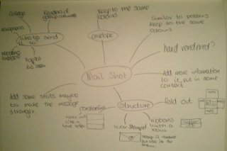
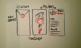
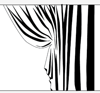
Ideas;

11 ideas
These were my 11 initial ideas. Thinking about having something which folds out, not just posters or a leaflet inside and envelope. But then thought about keeping the romantic theme by making the inside like a constantina, as it it was a love letter and it would open that way. Doing this I realised I needed to do more development before deciding on my idea.

Development;
Constantina, romantic theme.
Plain and simple, portrait envelope, posters inside.
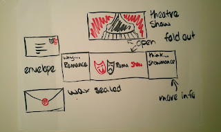
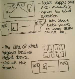
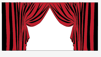
Show theme, open up to see what happens behind the curtains.
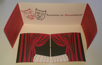
Looking further into it I decided to do the show theme. It is still keeping it simple, but adding information so that people will understand what it is I am trying to show, which is that celebrities take advantage of journalists and tabloids exaggerating the truth to promote films, so they can make more money.

More detailed development on my idea.
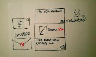
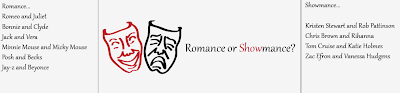
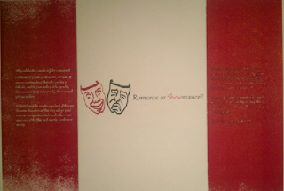
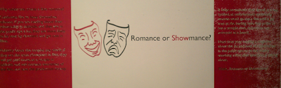
Black, red and the stock as my colours, keeping it consistant throughout this brief so that they all work as a set. Keeping it simple whilst including more information and detail. Keeping the same stock. Deciding on having a wax stamp but not sure of the design yet, needs working on. The show theme will work well as my tagline is 'Romance or Showmance', it will add a visual to the message of show.

Red, black and white cut out letters.
I started to think about whether I should make the mailshots by hand or digitally. These letter forms look to be copper black font, therefore wouldn't fit in with my theme, they wouldn't be relevant. Also I have to produce five mailshots, therefore it would be easier if I digitally produced these as I only have a couple of days for this brief.
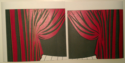
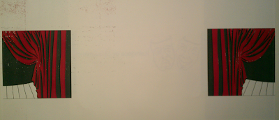
Designing the curtains on illustrator.
Duplicating them and flipping to make them full.
Having real couples in love on one side and fake showmances on the other.
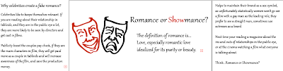
Showing different reasons why couples would lie about being in a relationship, with the definition of romance in the middle.
Same as the above but taking away the definition, keeping it simple and matching the posters.
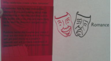
I decided that just showing examples of real romances and shomances would not communicate the message correctly, it may just confuse people. Therefore I decided to use the information about why couples would do this, it shows a lot of information about what I am trying to portray and why I am doing it.

Adding red to the information section.

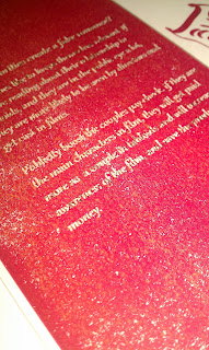
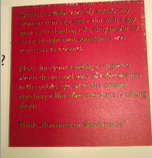
As my envelope is quite plain as I couldn't do it very colourful as it would make my wax stamp less effective. Therefore I decided to add some colour to the inside by turning my information pages red.

Front and back of my mailshot.
Creating a bleed, as double sided printing is not always accurate. 
To print back to back was difficult to set up but when you know it gets a lot easier. Making a bleed will allow for slight mistake in printing.

Stock;
Printed on cartridge paper.

Close up of cartridge paper print.
The plan was to use cartridge paper because its just off white, quite thick and it would work really well as my stock. Also although my posters were done on printer paper, that was just because of time issues, and will be printing them out on cartridge. Although these prints came out really badly, the writing wasn't readable and the block colours were no longer block, there for had to use printer paper.

Envelope;

Envelope design
This is the envelope design, I thought about making the opacity of the lines 30% so that I can still see the lines but they won't be as visible on the envelope when it has been constructed. The idea behind my envelope is to keep it simple. To show the romance in simplicity, a romantic font on the front with a wax seal on the back, whilst having my mailshot more informal, this is so the people are aware that the envelope and formality of romance is for show, inside it's not the same.

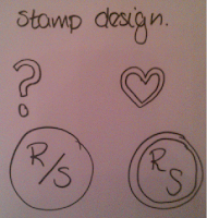
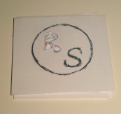
Initial ideas for stamps.
Designs on illustrator.
Carving from card.
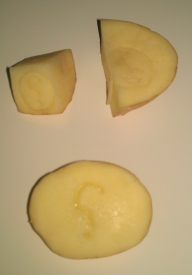
Carving from potatos.
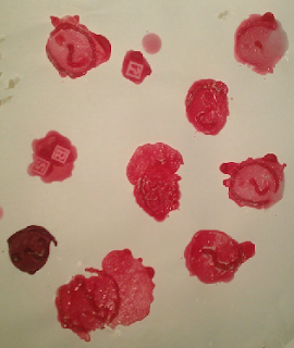
Experimenting for different stamps and waxes.
Whilst experimenting with different waxes and stamps, I found that the darker wax resembles the real was steals best. Also the card cut out didn't work therefore had to use a potato, which worked really well. The question mark worked best as in the others it was hard to see the detail.

Final products;
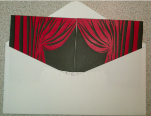
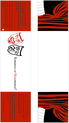
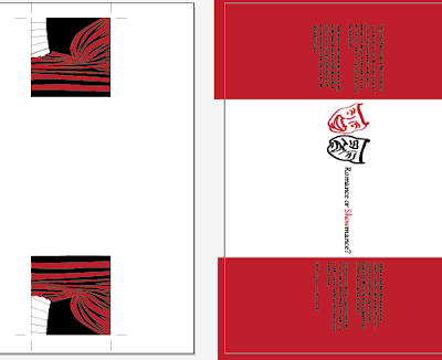
Mail shot in the envelope.
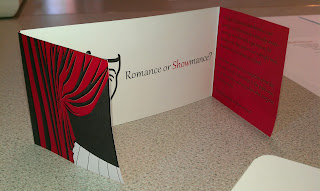
Mailshot.
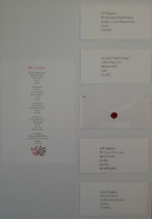
Arrangement for crit.
Although the stock used was just printer paper, it worked quite well as the colours were most effective, even though they were quite flimsey. If I had more time I would be able to experiment with more stocks so that I would get the density I wanted but for it to still be effective, colourful and crisp.

After crit;
As I was not happy with the quality of my stock, nor was I happy with the overall design as a set. My crit only showed exactly what I was unhappy with in my design, and therefore prompted me to want to change it. I wanted to change the typeface used throughout, especially the body copy. The layout of the mail shot, and add some decorative element to my envelope, because as a set they are look very plain and bland, this was not my intention. Changing both my posters and my mail shots so that they are also as a set and work using the same colours, stock and general theme.

New mail shot;

Double sided printing, not aligned.
Printing double sided I found very hard as it shows above its difficult to align the front and back. The colour and finish on this new stock looks really effective, although it didnt print in the correct place, therefore didn't work for me, and had to keep trying.


Double sided print, rubbing of the ink, as was not dry.
Printing on stock rubs the ink off.
Double sided printing also hindered my print quality. As you couldn't change the setting of the stock being used, and it is toner not ink, it does not stay on the stock very easily. The print is not dry enough when it get sent back through double sided, therefore pulls off all of the ink and it is then difficult to see the words on the page.

See through, double sided, very off.
The picture above shows how far out the double sided printing was, and how each time it came out differently, but never correct, as even when I managed to line up the prints, it took off the ink from the other side.

Stripey ink on stock, from peeling ink off others.
As Double sided printing was not working for me, I decided to print them off individually and stick them together, although this picture shows, the stripes on the paper from where the ink has stuck to the roller. After doing this I stuck the sheets together using extra thin double sided sticky tape, and it doesn't look very professional, and shows now quality, therefore I tried to get it printed digitally double sided.
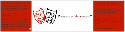
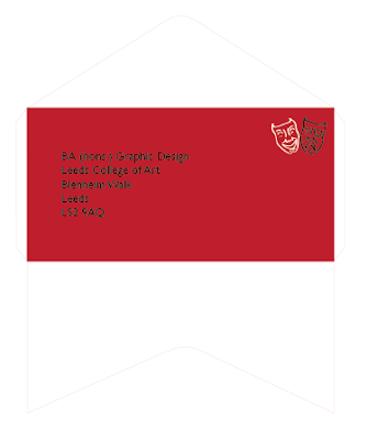
Finished mail shot.
Printing digitally also took a few times to get the print accurate, but it worked a lot better and looked more professional than the rest of my prints. Although as it has been digitally printed it is slightly a different red as the rest of my set. This is only a subtle difference but you can tell, this is because it has been printed with ink rather than toner.
Envelope development.
I decided to develop the envelope slightly more, as before it looked very plain and too simple, it looked slightly dull. By adding red to just the front of my envelope, it won't effect my wax seal, but adds something extra to my design, and still keeping it simple at the same time. Also applying the theatre faces to where the stamp would be gives it a place for the stamp, but also makes it aesthetically pleasing.
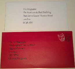
Old envelope and new envelope.
Showing both envelopes together shows just how much of a difference is made by slightly changing the layout and colour. Although I think what makes it much better is the fact that I changed the typeface, it has made all the difference, also using quality stock allows the product to be a higher quality.
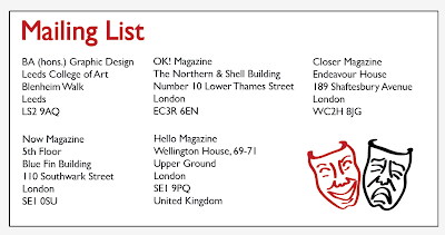
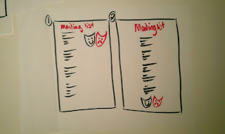
New mailing list.
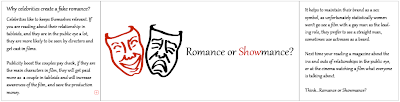
This was my initial design for my mail shot, although it didn't work before as the typeface is now Gill Sans, and before it was Gabriola. Before it looked to cluttered, it wasn't legible and looked really childlike. This on the other hand has a more effective layout, typeface and use of image.

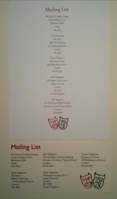
New mailing list and old mailing list.
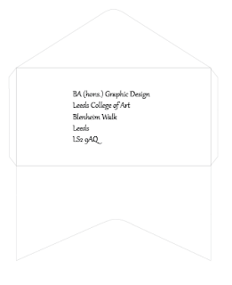
Comparing the old and new mailing list shows how inappropriate the original mailing list was. I agree with the people who critted my work, when they said that it looks like a posh food menu, and it definitely isn't suitable for my audience.

Evaluation;

This brief I changed many times, looking back on the original message and delivery brief, I should have chosen an article which has more depth. An article which has statistics and facts to use, rather than an opinion. Saying that I enjoyed the light heartedness of these briefs.

Changing my original designs has helped to communicate my message of awareness, although there is lots of things which I would change about this if I had more time. I would like the colour to be identicle to the colour I have used throughout as I believe it is strong and attracts attention, although I know that it is set as the same colour, it is purely the print quality. To improve these mail shots and envelopes I need to work on my crafting skills, as when sticking the individual mail shots together, I found that crafting is something I lack skills in.

Re-doing this brief over I would have considered stock a lot more, and how colours print differently to what they look like on screen. I also would have done more development work so that I can find my best design before I start printing. But overall I am a lot happier with my new mail shots and mailing lists, they work better and are a lot more effective.