First we were put into groups then given a word/words as our initial research word. We then got into groups to break down the words we were given and decided on which category each person should go for. Our group got the words 'Printed Text and Reading' and we came up with many different possibilities of the different categories we could get from these words.
Working in groups is hard as there is a lot of clashes with opinions, even though it was a minor task, some people wanted a certain direction which someone else had, therefore it would be easier to do it on your own, although this means that there would be less research collected. I got the direction of Branding and Identity in Printed Text and Reading, and then researched it a lot, to see this go to my Design Context Blog.
Layout of posters;
After collecting all of my research, Primary and Secondary, I had to think about how I am going to present the information, so started to experiment with different layouts.
This looks a bit confusing and busy, there is no structure and it doesn't work very well as there is no distinction between the catagories, they just mix together. I could improve this by using a line to define where one category stops and another continues.
Trying to squash everything I wanted to be in the poster in it, doesn't
look very good, it is too cluttered and doesn't look very professional
and the information is scattered around, all next to each other yet
different sizes.
I thought by changing the colours of inside the information boxes, it may balance the layout more, although I think the colour just makes it more confusing and I need to make it more simple and readable, especially as my original word is Printed Text and Reading, therefore it has to be readable.
I have made the layout more simple, all of the categories have the same structure to them, and taking away a lot of the examples and information makes the research posters appropriate and clear. Keeping both the primary and the secondary the same, using the same layout and theme, but then for my direction poster I will have the key word in the middle and visual research and examples surrounding it.
Secondary Research;
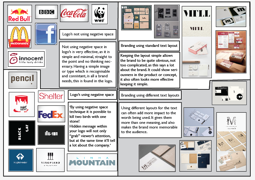
Through my initial research I decided that I found it more interesting to look at the brands and logos which are clever and humorous, which use negative space to play with the idea of the meaning of the company with the name of the company, also the layout of the text on the branding to show information about the company and the brand.
Primary Research;
Finding primary research of hidden meaning logo's and the layout of the text in branding is more difficult than finding secondary research. Although it is a very popular way of branding by putting hidden meanings into the logo, they are hard to locate.
Direction;
The direction I have chosen for my research for Branding and Identity in Printed Text and Reading is the way that people read logo's. Reading a logo should be easy and simple, even the hidden meaning ones, although if is takes a few seconds to get it and understand it will still work well as it will stay in peoples minds. The reason why the use of negative space and hidden meanings in logo's works well is because when the logo is clever it makes people think, they will remember the logo and the brand, which will help the brand.


No comments:
Post a Comment