Product and Packaging;
After researching Cadbury's roses, see my Design Context Blog, and after attending my crits I have many ideas of where I should take my research to incorporate either; Product and Packaging, Product and Distribution, or Product and Promotion. As my original direction when getting the word 'roses' was to re-brand the packaging and change some of the flavours, to make them more popular, as right now people wouldn't chose roses of all the chocolate variety boxes. Therefore I decided to go towards Product and Packaging, as that is where my direction was going anyway.
Initial ideas for Roses;
My primary research shows that most people would chose Celebrations over Roses, when asking them why I found that it was mostly to do with the flavours, the packaging and the fact that they believe it is directed towards older people, which makes sense as the flavours are all soft chocolates. Therefore I started looking into what I could change about the product and what I could change about the packaging.
When incorporating info-graphics into this, I would use the key on the back, as everyone reads it even when they know what flavour they are going to pick anyway, according to my primary research.
After the crit;
I got a lot of feedback in this crit, mainly to make the product quite playful and different, therefore I started by looking at the different packaging that I could use, something different and out of the ordinary.
This packaging would look good if the box was held together by coloured ribbon, obviously something which would go with the colour scheme, but it is still quite simple and ordinary.
This is a standard box with a complicated top, seen as though I had instructions and couldn't close this box, I don't think that it will be successful as my packaging, as it doesn't work very well.
This was the attempt at closing the box, which did close, but didn't look like it should look.
This box almost fell apart every time I attempted at closing it, therefore I won't be using this box.
This would work really well as one of the smaller boxes, as it looks like something that can be taken away, it could fit less chocolates in it, but that is the point in it. If I were to use this box it would be for smaller gift sized packages only, although the larger box will need to a similar style to keep it consistent.
Although this box is aesthetically pleasing, it is also really complicated, it is hard to close, and is very fiddly, this wouldn't be useful for my packaging.
This one could work well as the larger box, as it is simple yet pretty and elegant. Although if I were to make it again, I would give it more shape.
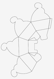
This is the last box I tried to construct, and I found that it looks the best of all the box nets that I have tried. It is elegant, pretty on the top yet quite simple to open and close It has a nice shape, and I think that it could be used for both the larger and the smaller box. Although making it larger I would have to elongate the box and change the scale rather than just making the hole thing bigger.
Drawing the net for the smaller box was quite simple, although elongating the box I found difficult to understand, although when I got the hang of it, I found that it was a bit easier. The only way I could find the whether the net worked, was to print them out and find the one that works best. It took 4 different attempts to find the box that works so well, without making the box seem as if is balancing on a small point.
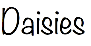
When looking into the packaging I was thinking about the brand Roses, and what colour scheme I should use. Then I thought that I would have to use a similar colour scheme as it is recognisable. I wanted to have more freedom with the packaging and the product, therefore as my name is Daisy I thought that I would create a rival chocolate, that is everything that Roses isn't, therefore thought I would create 'Daisies'.
Flavours;
I initially started looking at how I would be presenting the flavours in a information graphics style. I wanted to keep it simple yet effective also aesthetically pleasing. Therefore attempting to draw out different ways of creating the chocolates wasn't working for me, so I started to draw them on illustrator, experimenting with different colours and flavours.
Researching into the different flavours for chocolates, and making up a few, I asked people to select their top ten which they would like to find in a new chocolate selection box. I also asked which they would expect to find in a chocolate box called Daisies. Most people thought of natural things such as strawberry and mint, as Daisies sounds like it should be fresh and natural products. I found that my top ten flavours were;
- Caramel
- Orange
- Strawberry
- Cherry
- Truffle
- Mint
- Peanut
- Shortbread and caramel
- Honeycomb
- Milk
This shows quite a range in chocolates, therefore I can experiment a lot with how the different flavours could be displayed, also by allowing my target market to chose the flavours, in the chocolate box, they will be a success and appealing.
 |
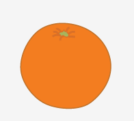
| Orange crunchy cream |
 |
| Double caramel |
 |
| Truffle |
 |
| Mint |
 |
| Strawberry/Cherry |
 |
| Honeycomb |
 |
| Peanut butter |
 |
| Shortbread and Caramel |
 |
| Milk |
Making a range of different variations of how to present the chocolates was the only way for me to choose whats works best with each other. I want each chocolate to be different and look unique therefore having this many options means that I will have a wide variation of illustrations.
What I found most difficult about choosing the honeycomb illustration was that I thought that these would both work really well. I thought the one on the left would resemble the product well as it is showing the flavour whilst also showing it in the shape of a flower which links to the product 'Daisies'. Whereas the one on the right would also work well as it shows the flavour honeycomb more clearly. Therefore I thought that I would go for the clarity.
These are the illustrations I have chosen, I have tried to go with variety, but also show the content within the chocolates. The idea behind these chocolate illustrations is that you can see what the chocolate will look like when bitten into. What I think is lacking about Roses was that there was no description or image of the chocolate, there was just the wrapper and a name, this doesn't give anything away. Having it be a surprise could be a good thing, but it doesn't work very well with Roses as they are all similar flavours anyway.
Producing the logo;
I started by looking at having the name as 'Daisy's' or 'Daisies'. And I couldn't make a decision therefore started to look at the different fonts I could use for my logo, and see what looks best.

 |
| Monotype Corsiva |
 |
| Tw Cen MT |
 |
| Times New Roman |
 |
| Tekton Pro |

 |
| Tamil MN |
 |
| Noteworthy |
 |
| Modern No.20 |

 |
| Gabriola |
What I was looking for with my typeface was that I wanted it to be playful, but not look childish and patronising. I found that Gabriola and Monotype Corsiva both suited what I was looking for, although Monotype Corsiva looks more sophisticated, and I think it would work best as my typeface and to go on my logo.
I then started to look at having a Daisy as the logo, maybe both the Daisy and the text together.
Pink or White? More Petals or less? Using pink for the flower makes it look too girly, and I don't want 'Daisies' to be just associated with girls, I think having white keeps it neutral, doesn't hold a certain audience.
I decided to go somewhere in the middle, not too many petals, but enough to make it look full.
This is the finished logo, with this I am able to create my stickers for the wrappers and the packaging.
Making the chocolate wrappers;
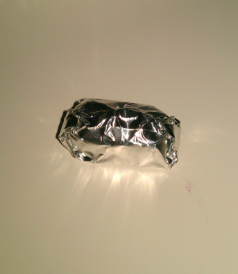
The initial plan to make the wrappers was to print onto coloured cellophane, but then I found that you can't print onto ordinary cellophane with normal ink. Therefore I decided to keep it plain and simple but having coloured cellophane with foil underneath, this was also hard to find as the colours for the cellophane were very limited, and I wouldn't want to compromise on the colours of the wrappers, as I want them to reflect the product. Most of the colours were dull and dark, there was also only 8 colours that I could find, which wouldn't work as I have 10 different flavours. This meant that I had to work with foil then coloured tissue paper with cellophane on the top with a sticker to seal it.

The colours work really well, I had to test how to wrap the chocolate many times, as the first attempt looked very bad, and not professional at all. As there were so many layers to wrapping the chocolates it was hard to make them look presentable. If I had unlimited money and time, I would be able to print onto the wrappers, with the logo, or some information about the chocolate inside.
Pantone;
To get the correct and accurate colour match I decided to use a pantone book to find the exact colours of each chocolate. This is so that I can use the colours in the packaging, on the key for the chocolates also to show the wrappers for the chocolate on the key, this is so that there is no confusion when it comes to identifying each chocolate.
The pantone reference for each colour;
- Pink - Pantone 210C
- Light Green - Pantone 7487C
- Dark Green - Pantone 347C
- Yellow - Pantone 3945U
- Light Blue - Pantone 299U
- Dark Blue - Pantone 286U
- White - White
- Red - Pantone 32U
- Orange - Pantone 1505U
- Violet - Pantone 253U
Applying some of the colours to the packaging showed what would work and what wouldn't work, I did this using the pantone values for each of the colours.
Although both of these designs are very simple, with just a logo on it, I prefer the green, this is because the pink looks too similar to candy floss, it will pigeon whole the chocolates into only girls buying them, also it looks very twee. Whereas the green is a neutral colour, it also symbolises nature and goes better with the idea of Daisies and grass, therefore this will work better for my packaging.
I started by drawing up some plans of how I could layout my designs, I then decided that drawing it out didn't give me a good view of how it will look, although it did give me an idea of where to start with it. This is why I started to work on illustrator as it is clearer to see, and things can be adapted quickly.
I thought a lot about the layout for this as it is my main piece of information graphics, I want it to come across simple, but I don't want there to be no information on it. I also want to keep it playful, add a cheeky bit of text at the end, and have the logo on there too. Having a single page for the logo will work well. The page is measured so that it can fit in the top of the box, and having the top page being my logo will look really pleasing.
I decided that I would make an extra piece of information graphics to display my target audiences favourite flavours through my illustrations.
Finished products;
 |
| Small box |
 |
| Inside the small box |
 |
| Large box |
 |
| Chocolate key |
 |
| Top of large box |
The large box didn't print out properly as it cut off one of the tops of the bits that hold the box closed, therefore I will need to reprint this. There are four different flavours in the small box, these flavours are the ones that were voted the favourite. It has also worked that they are all the natural colours of Daisies (Green, Pink, White and Yellow). I am happy with the packaging, as I prefer packaging to be simple yet aesthetically pleasing, although the chocolate key might be too simple, it is also very white, which means I may need to reprint and change the stock or the background colour.
After the crit;
After the crit I decided to make some changes with my chocolate key, I also need to reprint my box, and change some of my spellings. I want to make the key more playful, so that I can have some fun with my audience. By adding illustrations and text to the key this will make the key more friendly and softer, rather than neat and simple.
Drawings on illustrator;
New Chocolate key;
There was too much white on my old chocolate key, so I thought about changing it to the same colour as the box, I also added my illustrations to each flavour. Some illustrations were harder to think of than others which were very obvious. Adding them in allows the design to be more playful and will attract the audience. I also added a 'How to...' on the back, and the poster that I made about the most popular flavours, this will give the audience more information, and keeps it nice and light.
Whether to have the instructions first or after the information about the most popular chocolates.
This is how the end thing will look. By doing this double sided it will allow me to show more information, allow the design to be more fun, but also making it easy to follow and clear.
Finished Product;
Evaluation;
If I were to do this again, I would change many things, as the before the crit I noticed that I had a few spelling mistakes and the actual packaging had cut off the top of the box when I was printing, therefore I did change them and next time will be more careful. Through the actual production process of this brief we weren't able to have a crit due to weather conditions, therefore I just worked on what I thought I should do, but after the crit I realised that it was too simple, and it needed to be more playful, therefore this is why I decided to adapt it.
I prefer the product and packaging after the crit as it has more detail so that it makes it playful and creative, but not too much that it looks tacky and cluttered. I decided to add some information graphics on the back of my chocolate key to make it more interesting. If I were to re print or to bare in mind for the next brief is to add more of a bleed to my work as printing double sided does not guarantee that they will be back to back, therefore I had to cut off more than I wanted to on my chocolate key, also pay a lot more attention when scoring the packaging. I would also have looked further into where my product would be sold, as if it was on a lower shelf, the label might not be able to be seen due to the shape of my packaging, therefore I would take that into consideration more.
 My primary research shows that most people would chose Celebrations over Roses, when asking them why I found that it was mostly to do with the flavours, the packaging and the fact that they believe it is directed towards older people, which makes sense as the flavours are all soft chocolates. Therefore I started looking into what I could change about the product and what I could change about the packaging.
 When incorporating info-graphics into this, I would use the key on the back, as everyone reads it even when they know what flavour they are going to pick anyway, according to my primary research.
 This packaging would look good if the box was held together by coloured ribbon, obviously something which would go with the colour scheme, but it is still quite simple and ordinary.
 This is a standard box with a complicated top, seen as though I had instructions and couldn't close this box, I don't think that it will be successful as my packaging, as it doesn't work very well.
 This was the attempt at closing the box, which did close, but didn't look like it should look.
 This box almost fell apart every time I attempted at closing it, therefore I won't be using this box.
 This would work really well as one of the smaller boxes, as it looks like something that can be taken away, it could fit less chocolates in it, but that is the point in it. If I were to use this box it would be for smaller gift sized packages only, although the larger box will need to a similar style to keep it consistent.
  Although this box is aesthetically pleasing, it is also really complicated, it is hard to close, and is very fiddly, this wouldn't be useful for my packaging.
 This one could work well as the larger box, as it is simple yet pretty and elegant. Although if I were to make it again, I would give it more shape.
 Drawing the net for the smaller box was quite simple, although elongating the box I found difficult to understand, although when I got the hang of it, I found that it was a bit easier. The only way I could find the whether the net worked, was to print them out and find the one that works best. It took 4 different attempts to find the box that works so well, without making the box seem as if is balancing on a small point.
 Researching into the different flavours for chocolates, and making up a few, I asked people to select their top ten which they would like to find in a new chocolate selection box. I also asked which they would expect to find in a chocolate box called Daisies. Most people thought of natural things such as strawberry and mint, as Daisies sounds like it should be fresh and natural products. I found that my top ten flavours were;
 What I found most difficult about choosing the honeycomb illustration was that I thought that these would both work really well. I thought the one on the left would resemble the product well as it is showing the flavour whilst also showing it in the shape of a flower which links to the product 'Daisies'. Whereas the one on the right would also work well as it shows the flavour honeycomb more clearly. Therefore I thought that I would go for the clarity.
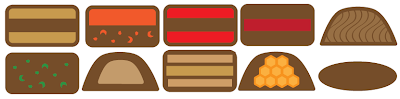


 Pink or White? More Petals or less? Using pink for the flower makes it look too girly, and I don't want 'Daisies' to be just associated with girls, I think having white keeps it neutral, doesn't hold a certain audience.
 I decided to go somewhere in the middle, not too many petals, but enough to make it look full.
 This is the finished logo, with this I am able to create my stickers for the wrappers and the packaging.
 The initial plan to make the wrappers was to print onto coloured cellophane, but then I found that you can't print onto ordinary cellophane with normal ink. Therefore I decided to keep it plain and simple but having coloured cellophane with foil underneath, this was also hard to find as the colours for the cellophane were very limited, and I wouldn't want to compromise on the colours of the wrappers, as I want them to reflect the product. Most of the colours were dull and dark, there was also only 8 colours that I could find, which wouldn't work as I have 10 different flavours. This meant that I had to work with foil then coloured tissue paper with cellophane on the top with a sticker to seal it.

 The pantone reference for each colour;
 Although both of these designs are very simple, with just a logo on it, I prefer the green, this is because the pink looks too similar to candy floss, it will pigeon whole the chocolates into only girls buying them, also it looks very twee. Whereas the green is a neutral colour, it also symbolises nature and goes better with the idea of Daisies and grass, therefore this will work better for my packaging.
 I started by drawing up some plans of how I could layout my designs, I then decided that drawing it out didn't give me a good view of how it will look, although it did give me an idea of where to start with it. This is why I started to work on illustrator as it is clearer to see, and things can be adapted quickly.

 I thought a lot about the layout for this as it is my main piece of information graphics, I want it to come across simple, but I don't want there to be no information on it. I also want to keep it playful, add a cheeky bit of text at the end, and have the logo on there too. Having a single page for the logo will work well. The page is measured so that it can fit in the top of the box, and having the top page being my logo will look really pleasing.
 I decided that I would make an extra piece of information graphics to display my target audiences favourite flavours through my illustrations.


 Whether to have the instructions first or after the information about the most popular chocolates.
 This is how the end thing will look. By doing this double sided it will allow me to show more information, allow the design to be more fun, but also making it easy to follow and clear.