In this brief we had a partner chosen from the randomiser and I got
Adam Garbutt. We then had to fill in questionnaires about our selves,
then we found that we had to create a typeface and 6 glyphs showing
characteristics of our partner. This is when we thought that the
questions we had previously answered were not sufficient amount of
information about the other person to produce a typeface on them.
Therefore we collected our own information afterwards.
The questionnaire;
Our own information;
First
we wrote out an alphabet in upper and lower case for each other, so
that we could see each others hand writing, I also asked Adam to write
out his name, as he joins up his writing.
Quiet person when not drinking
Easy to talk to
Perfectionist
Mostly happy (when not hungry)
Deep sleeper
Printing type
Horder(polythene bags, train tickets, pen nibs)
Likes collecting things
Hairy
Leather shoes
The rest of development(american show)
Back to the future
Quentin Tarentino
Matrix
Custard-Lollipops-Chewing gum(to stop from biting nails)
Near Middelsborough-Skelton
2 brothers, 25, 27
Don't go on nights out a lot
Dog Person
Arial - Arial Rounded - Gill Sans
Lowercase
Sag and Walsh
Fruit
Walking
After
finding this information I started to research Adam's likes and
dislikes, looking at his blog, even at his facebook, to find out more
about him. I started looking at the different designers which he likes, and taking things from each and experimenting with different styles and ideas onto my typeface. Adam's favourite fonts are Gill Sans and Arial, so tried working with both of them, to see which looked best.
The first example is Arial, and as Adam joins his writing I thought I would show that through the typeface. The second is Gill Sans with structure, as he is very structured and organized so thought that this would work well. The third is Arial round, but I don't like this typeface, it looks quite childish, that's why I chose and illustration to go in it, and its footprints because he enjoys walking a lot. The forth one is geometric and made of lines, this was taken from a designer which he likes, therefore thought it would work quite well.
This was to experiment with a few different styles, and produced them on paper so that I could take them into my crit to get opinions and ideas on what I have been doing. The crit really helped me as although it didn't give me many ideas, it made me realize that I am focusing too much on making the typeface exactly like Adam, where I should be just using an element of his character and personality. It should also be from my first impressions of him, so this means that I can now go back to one of my initial ideas.
After my crit I started to do a bit more development, and then I had to decide on an idea to use. I started with doing an entire alphabet of different ideas in pen, then some in pencil.
 |
| Examples in pen |
 |
| Examples in pencil |
I then choose a few of my favourite letter designs and did a series of each to see which one would look better as a set. When doing this I also had to consider, which portrayed my first impressions of Adam.
 |
| 1st Example |
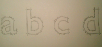
This was trying to portray structure by using some sort of stick to form the letter, but I think that this just looks like floating sticks, it looks very out of place, and think it would look a bit random as letters, I don't think that the structure concept comes through very well, although I like the idea of creating the letters using straight lines.
 |
| 2nd Example |
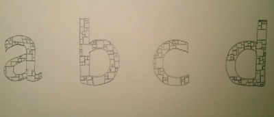
This idea was trying to show his organization side, by showing that he has order to his life, and that everything has a place, big and small things, this is why I used boxes. But I think that this idea is too complicated its not very simple, which is what I wanted it to be. Also it may not come across very well as everything has its place, it could just look like random squares.
 |
| 3rd Example |
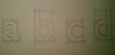
This idea shows the letter forms being created purely of sticks or lines, just some sort of structure, but this time they have a base, and all it makes sense. They all need to be straight as in this example they are not, this needs to be improved. But this would work a lot better than the first one.
 |
| 4th Example |
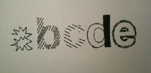
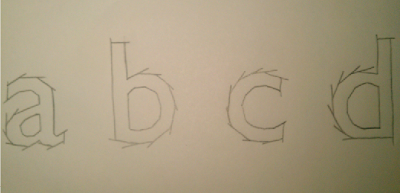
Letter forms made of straight lines, this idea doesn't work very well as it looks slightly like fireworks. It also doesn't show Adam's personality that much, unless he likes bonfire night. I don't think I can use this idea.
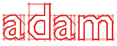
The 3rd Example I think works best as a letter form and also shows my first impressions of Adam really well. So using this I looked at putting block colour into, as I had the initial design but how would it work.
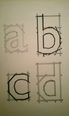 |
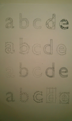
| Development using ABCD |
Doing a few subtle differences with each of them to see what looks better. I decided that their should be fewer lines on the inside of the letters, and it is a better effect, and the same on the outside of the letters. Try to make it as simple as possible. In this I preferred the 'a' to the rest, although I like the black boldness of the 'c' I only liked the 'a' because of the letter, so I thought I would try them out on the same letter, so there is no biased judgement.
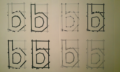 |
| Development using B's |
I chose four which I most preferred and thought worked best and tried them out on another letter to see if it works on others as well as it does on the 'b'.
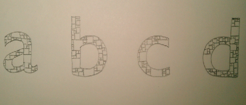
Out of these four I thought that the first one works the best, and is the most effective, it shows the letter form really clearly whilst also showing the structure and detail behind it, it doesn't hide and of the structure.
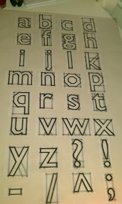 |
| All drawn out, measured and placed |
Placing them all out on a A1 tracing paper to get them inline, allowed me to move them round and experiment with different layouts to see which looked best. I could also see if something was wonky, so that I can just move them.
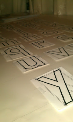 |
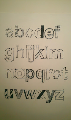
| Each individual letter drawn out separately |
Each letter was drawn out individually so that if I went wrong I wouldn't have to start again I could just do the letter again, also it makes it easier to do the final sheet and not go wrong, as all I had to do was trace it through. Also before actually drawing anything on the trace, I had to test different pens to see which would work best, and which wouldn't smudge, which is my main concern.
 |
| Testing pen lines |
Finding the best pen means that I could start doing my main letter forms, and ensure that I don't have to wait for the pen to dry so that it doesn't smudge.
 |
| Final Piece |
Designing my badge for Adam was easy as I could use illustrator, and its just simple lines. I also knew what I was going to do with it, I wanted it to be red because it's Adam's favourite colour and it was the first thing he told me.
 |
| Example 1 |
 |
| Example 2 |
I decided to go with the first one, to keep it consistent with my main type face, and the whole point was to see if it worked smaller and larger, so I kept it the same.
 |
| Name badge |
I think my name badge came out very well, it works well its small.
 |
| Adam wearing my name badge |
After my final crit, I got a lot of feedback and decided to develop my letter form a bit more by seeing if it works the same even bigger, with numbers, with capital letters. I also wanted to redesign the 'g' as the feedback I got from the crit (which I agree with) was that its the only one which is complicated and the rest are simple, therefore I wanted to rework the letter.
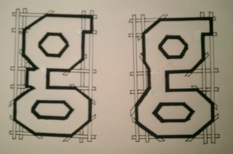 |
| Two more simple versions of 'g' |
 |
| Final 'g' |
If I were to do it again I would do my 'g' more like this as it is simpler, and fits in better with the rest of my letter forms, but still resembles the letter 'g'.
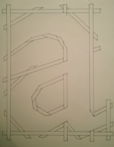 |
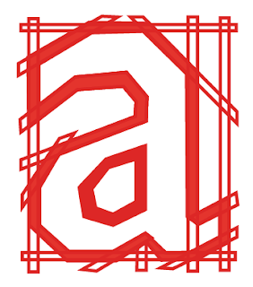
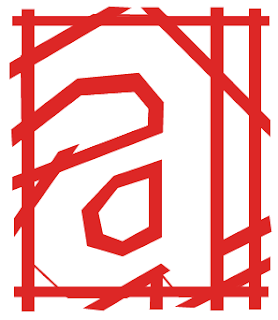
| Large non filled 'a' |
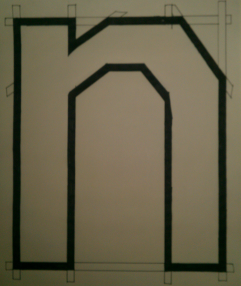 |
| Large finished 'n' |
This shows that my letter form would work even larger. This is the size of a full A4 sheet of paper. If anything it is even better than the smaller ones as it shows less detail, and more simplicity as the lines aren't as close together, and doesn't look as cluttered.
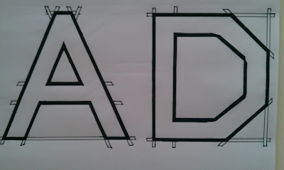 |
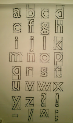
| Capital letters |
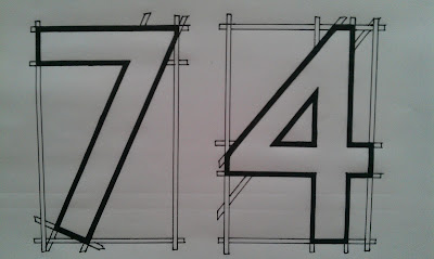 |
| Numbers |
This shows that my typeface would be successful as it works in many different letter forms, upper and lower case, also punctuation and numbers.
Evaluation;
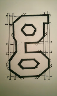
In this brief I think that I portrayed some of Adam's characteristics, and some of the things he likes. If I were to do this again, in hindsight I should have seen how the 'g' didn't really fit into the typeface I made, only as it was slightly too detailed, whereas the rest of my letter forms were very minimalistic. This is why I decided that after my crit I would draw up an improved letter 'g' to see if it would work, I also did larger letter, numbers and upper case letters.
|
| Final 'g' |
I found that the 'g' would work, so this was very successful, therefore I wish I would have seen this before the crit so that it could be corrected.
Also if I were to do this brief again I would be more accurate with my drawing on the final sheet, as I made a few mistakes, and slightly went off on some of the letters. I also thought that I could have created a better 3D effect with the scafolding, this could have been taken further, although I would have needed slightly more time to do this.
Overall I think that this was a good brief and there are many things which I could have changed or slightly adapted in it, but as there is always a time limit on a brief, I had to reach an outcome, and I was happy with this.