The question we got given was ‘How to...not to fall asleep during lectures.’ this was a difficult brief to answer, the first thing we did as a group was brainstormed on a few A2 sheets and tried to answer the questions;
- Who needs to know?
- What/Why do they need to know?
- How will you tell them?
- Explain, Inform, Instruct or Educate?
- Where will they look?
- How will they interact with it?
- How will you know its working?

We came up with many different ideas for our brief such as; electric shocks, water spraying in the face when you fall asleep and the lecturer having a fog horn. After our group swapped many ideas, we came up with a product as we decided on the most fiesable and the product we thought would work and communicate our message best. We decided on branding and producing packaging, leaflets and posters for caffine tablets. Me and Suzie did the primary research of asking students at Leeds College of Art, if they have ever fallen asleep in Lectures, and if they would take energy enhancing substances to stay awake, this was to see if there was a gap in the market for our product.

We had our name and concept, so we all went away and worked on logos. Suzie, Tristen, Sam and Sean worked on logos with the colour scheme CMYK and tablet shapes, these are some of Suzie's.


After a discussion we chose our logo so we could start on designing the packaging posters and leaflets. The logo we chose was designed by Suzie.

I researched packaging and as a group we decided to go with a slide in and out packet. I made four slightly different sized boxes, until I found the one that was perfect, then produced a net on illustrator.


We decided to keep the packaging simple and keep to the colour scheme of CMYK. And wanted to have different flavoured tablets, and thought of doing a different flavour for CMYK as it was our colour scheme. The initial idea for each box was for them to be the colour either CMYK depening on the flavour. Blueberry being blue, Cherry being Magenta, Banana being Yellow and Black being mint.


These are two of the feedback sheets we received from our group crits, and we found that they were very helpful.

The group crits gave us the opportunity to see if our idea would work and what people think of our product and how we could improve it. This is the feedback of suggestions we collected;
- Black doesn’t work with mint
- We need more information on the packaging, to make it look more real
- Too limited to LCA, should expand to make the brand more reliable (if it was in boots for example)


The Final Packaging, Poster and Leaflets.


Preperation for our presentation with the final products.


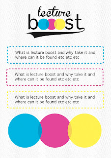
Our power point went very well, Sean designed it, he kept it simple, and kept to our colour scheme of CMYK, so our theme is consistant throughout. This is a slide from the presentation, they were all the same layout and the writing was kept very basic so they we could use them as note in the presentation rather than just reading them from the power point.
We showed everyone why they should use Lecture Boost, and explained the design concept, and how we used CMYK because its specific to Graphic Designers and Leeds College of Art students.

No comments:
Post a Comment