Business Card Designs.
The business cards are one of the main deliverables which need to be designed for February at the latest, this and menus need to be designed for then, ready to print. This has been my main priority during this brief as it has a much sooner deadline. The business cards had to include the name, address, phone number and opening hours.
Development.
I decided to create small icons to represent the logo, location, phone number and a clock for the opening hours. I think that this could work well, although it depends on how much information I will be putting on the business cards.
I think that it would be a good idea to use the illustrations of the characters I created on the business cards as Sonya is the face of the business.
I definitely think that it would be appropriate to use pink in the business cards, as it is the main colour in the cafe, obviously.
I decided to play around with different layouts for the business cards, trying out using the icons and different coloured type and backgrounds. The client suggested that I create a few different business cards so that she can chose which one she prefers for the business.
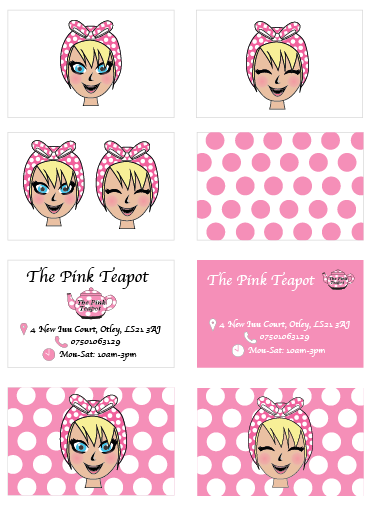
Here are the fronts and backs of the business cards that I took to the client. She was looking through them and found that she wanted a design with the character on the back and the information about The Pink Teapot on the front.
This is the design she has chosen. I think that this would work really well for The Pink Teapot, its reflects the personality of the cafe really well. Although I did decide to change the typeface of the information to Arial, as I think apple chancery is harder to read, and I just prefer Arial.
I have decided to mock the business cards up so that I could give Sonya a better idea of what they would look like in person. After doing this she immediately sent off for 500 business cards with this design on them.
Stationary.
After creating the business card, I found it really easy to create the letter heads and notebooks for the cafe as I just followed the same aesthetic as the business cards. Sonya wanted some notebooks for each of the three main staff including the owner (Sonya). I think that using Arial as the typeface works a lot better, and it consistent with the business cards, and will also be consistent with the menus. I think that using each of the characters on the front of the notebooks will establish the different between each persons notebooks.
The letterheads also follow the same aesthetic as the business cards without using the spotted background, as I don't think that it worked well with the polka dots on the letterheads.
Mock Ups.
The Stationary all work really well together. I think that have different notebooks for each of them will be a good idea as they currently all use the same one. I am really happy with the busienss cards and stationary I have created for The Pink Teapot, they reflect the personality of the cafe really well.


No comments:
Post a Comment