Developing my Penguin Collection.
When I started thinking about creating a Penguin collection I had to think about what kind of Penguin I wanted to use, as there are 18 different species of Penguins. My favourite species is Chinstrap so I am going to use them, but I thought about having either a different collection for each Penguin depending on their characteristics. For example I could have an Emperor Penguin for a collection about being the boss and biggest, very important things, and have use a Galapagos Penguin for something like, checklists for holidays, make sure you don't forget anything to take on holiday, or for planning your holiday. If I were to do this, I would have a lot of different Penguin collections and I don't want the brand to purely be associated with Penguins, therefore I think I will just stick with the one Penguin Collection.
Penguin Pegs.
I develop my work by producing it, therefore I created many different layouts for my Penguin Peg Packaging to see which one I prefer and think looks best and appropriate for my shop and target audience. As I'm not going to create different collections for all the different species of Penguins, I have already made illustrations of four of the different species of Penguins, so thought that I could include different Penguins for different items in the collection. After producing some of the packaging with all the Penguins on them, I found that just because I have created the illustrations, it doesn't mean that I have to use them, as I don't think it would be a good idea, I think it should be one species of Penguin throughout the whole collections to keep it consistent.

My initial thoughts for the collection was to have the Penguins waddling as if they had somewhere they needed to be. These are the illustrations that I am going to be using at the bottom of my notebooks, so thought I could use them on my pegs.
I want all of the packaging to be simple and to the point, I don't want a lot of type on them, as I think that often in stationary shops there is a lot of type and information on the products, which makes them all look very samey, therefore mine will look different, having just the minimum information on each product. The layout works for this as it is balanced out, although the Penguins waddling is the same as the notebooks, and I think I should have the Penguins doing different things for each product.
Adding the Penguins being hung on string as if they are the pegs looks a lot better and more appropriate for this product. I have found that I think it is necessary for their to be the name of each product on the packaging as will as the logo of the shop. Therefore the bottom one is better, although maybe I shouldn't include the waddling Penguin at all as its not necessary.
Creating the Pegs.
After researching different pegs and peg packaging, I found some glittery pegs, and I think that this will look good for the pegs themselves. Using black and white glitter will relate to the Penguins, so this is what I will do.
I started by trying to glue the glitter straight to the pegs but I found that you can see straight through the glitter and see the brown peg, which doesn't look good, therefore I had to cover each of the pegs with white paper for a base as it looks a lot better and has a higher quality about it.
I was going to create eight pegs, but as each of them took so long to make, because of the cutting out of the paper, I decided that I would just make six, as a lot of the pegs I researched were either really small and there were 10-12 of them, and the large ones were 6-8 of them, therefor six of them will work fine.
Peg Packaging.
Experimenting with different layouts and printing them out to see what they will physically look like on the stock I have chosen. I started to try out adding glitter to the packaging, but I think it looks a bit tacky, therefore I will definitely not be using glitter on the packaging.
I think that the design which looks best is the Penguins hanging from string, it is the most appropriate and looks most aesthetically pleasing. The middle layout I think works really well as it is balanced and it has enough space for the staples to attach the pegs without covering any of the type or illustrations. Although I think that the position of the string and Penguins hanging may need a slight adjustment.
Penguin Peg, String Holders.
When creating my peg holder I also looked into a way I can put the string into the packaging, I thought about having I wanted them to follow the same theme as they will be in the same pack. If I were to use the waddling Penguin I would have used this string holder.
As the peg holder has illustrations of Penguins hanging off a string, I want to keep the string holder the same as peg packaging, therefore I think the bottom string holder is the best design and layout.
After creating the designs for my packaging I realised that I need more accurate measurements of the pegs and how they will fit together so that I know how big to make the peg packaging. I think that the pegs look a bit bare, and there is something missing.
Adding Penguin heads to the pegs make them look more like penguins. Also after researching decorative pegs, I noticed that most pegs are plain with something stuck on the top, so I thought this will allow them to look more decorative.
Penguin Brads.
I wanted to create a new illustration for the brads, similar to the pegs, I want them to relate to the brads. I thought that having a simple circle like the brads with just a Penguin face on it, this will be relevant for the brads. Keeping the logo and product name central to the packaging is something I want to keep the same throughout all the products, as it would look strange if all the other products had a central logo and only the brads were different. I think that the bottom right packaging would look best, as all the brads I am creating are blue, I could also create cream brads and use the same packaging.
Pens and Pencils.
These are the testers for the coloured pencils. The blue card didn't work on the pencils as the penguin illustrations are too far apart and after they are wrapped around the pencils, the illustrations disappear and it ends up being pointless. The cream fits around the pencils better as I made the Penguin illustrations closer together.
Penguin Belly Bands.
The belly bands I have created are for the coloured pencils and the notebooks. As I want to keep the packaging simple and to the point, I want to keep just the logo and the name of the products on the packaging. Because the notebooks and the coloured pencils are covered in penguin illustrations, I think that keeping the belly bands plain and simple looks best.
Penguin To Do Lists.
The Penguin To Do Lists come with 4 to do lists, two of each colour, and two of each size (little things, big things). When creating the to do lists I wanted them to have the same waddling Penguins in them, they create an affect that they make you want to turn over the page and get more things done. I created both 'little things' and 'big things' as when I am doing work and have task I need to do, I prioritise the tasks, the things I have to get done, and the things I want to get done. I think having two different to do list books is something that is really useful when doing work, or having tasks that you need to do.
Penguin Colouring Pencils.
The colouring pencils are my favourite product in the Penguin collection, they are very aesthetically pleasing and fit it really well with the collection. I have used the same pattern on the packaging of the pencils as I have on the notebooks, this is to keep some consistency through the collection, also people usually buy pencils and notebooks together. The only fault I have with the pencils is that there are 11 coloured pencils and I wanted to have 12 in there, although they could fit all 12 pencils in it, they were really hard to get in and out, this is why there is 11, as I removed the white pencil.
Penguin Brads.
Before I did this project I didn't even know what brads were, but after creating them I have found that would be a really helpful thing to have, it would help to keep documents together, and look really good. Ideally I would have created my brads using material rather than paper, but I couldn't find a good colour match to print onto, therefore I used paper to see what it would look like, and I think that they look really good as a set.
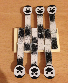
Final Penguin Pegs.
I am really pleased with my Penguin Pegs, I think that even though the product is glittery and a bit different, they work really well and fit in as part of the collection. Also creating the hole for the Pegs to be hung from a bar makes them look more like a product being sold in a shop, rather than just something that is being proposed to be sold in a shop.
Final Penguin Notebooks.
Creating three notebooks that all follow the same theme of a Penguin waddling across the bottom of the page means that they can all be sold as a set, although they will also be sold separately too. Each of the books are slightly different, one is lined, one is plain, and one is both. If I had more time I think I would create a larger notebook that is hard backed, but it would follow the same theme of the other books.
Final Penguin Collection.
I am really happy with the final collection, obviously for the shop there would be more collections, and probably more in one collection, but I have had a time limit, therefore I have produced all that I could in the time. The stocks I have chosen and colours I have used are the same as my branding and identity for the business, this is because this works well for the collection I was producing. If I were to produce another collection, for example pugs, I may use the same cream stock with a pink, it is just because the colours worked well with Penguins, why I used the same for both.


No comments:
Post a Comment