Proposing 100 Things To Do.
I am creating a shop called 100 Things To Do for my Design for Print and Web brief, which means I actually have to have a shop to go into, therefore I decided that I would draw a shop window on illustrator and the doors to it and propose that this is my shop, and I am going to put my logo and shop name onto it.
Shop Design.
I started by looking into the different colours my logo could be so that I could see what looks best on the front of the shop. My initial idea is to have a logo that can change its colour depending on which product its on, therefore right now for the shop window it doesn't really matter what the colour is.
I then started looking into different layouts for the shop, I could change it up for the front of the shop, and then have a sign on the side showing what the actual logo is. Although this could be a bad move, you shouldn't really change the logo too much. I thought that if I do lots of different versions of the shop front and the signage, I can take them to the final Print and Web crit and propose them all to see what everyone else thought.
I also thought about having the name of the shop on the front and having the logo as signage, I think this would work better if I wanted them to be different as it could look better. If I had just '100 Things To Do' written across the front of the shop, on its own, or maybe with a small logo on it somewhere, then create a sign for the side of the shop with just the logo on it. this is another idea that I am going to take through to my crit and see what people think about it.
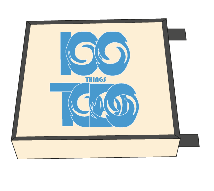
Creating the sign for the shop was done in the same way as the shop, I just drew it on illustration, then applied my logo to it, I think this works really well as my logo fits onto this sign, and looks balanced and like it should be there. Also the blue works really well on the black background. I think that I am going to keep my logo the same colour throughout all of my branding and collections as consistency is key.
After the Crit.
In the crit I found that I got a lot of feedback and a lot of it was very helpful, and it made me look at my idea in a different way. After the crit I was looking back at my logo and decided that I didn't like it anymore, I think that it looks very flat and boring, which doesn't reflect the message my shop is trying to show. Therefore I kept the same concept behind my logo but changed it slightly, going back to something I had looked at previously, I think that the logo I have created is better suited to my target audience but also better suited to my shop.


This is my logo applied to the shop and the signage. Also after the crit I started to develop my branding for the business and the collections that I was going to sell, this led me to think about the colour of the shop and whether or not it would be appropriate for it. I decided to keep the colours the same as my branding, so I changed colour of the shop, which I think is more aesthetically pleasing and inviting, also it keeps consistency through my branding.
Other Things Proposed.
I thought about the shop and the way it could be advertised, thinking about adverts in magazines, or television adverts, but I went with a bus shelter, as it is a high street brand, and the target audience is more likely to see it this way, therefore I thought I would keep it simple and show people what is new in the shop. Using the same colours as the shop and the branding means that if people are looking to go to the shop, they could find it easier as they know what they are looking for.
I also thought about the fact that I would need a delivery van to get there products to and from the store, also if people order anything from the online store, I would need a van to deliver my products in, therefore I have proposed a van that could be used. I have designed it so that it would follow the same theme as the rest of my branding, so it can easily be recognised.
I decided that a polo top is suitable for both men and women who will work in my shop, therefore I have proposed a blue polo shirt with either jeans or black trousers for the uniform for the shop. I have superimposed an image of my logo onto the top so that I can see what the top would actually look like. The colour of the polo top also works really well with the logo.
The canvas bag is something that I actually wanted to physically print, although I ran out of time, if I were to redo this brief I would have planned my time better so that I could have screen printed onto my canvas bags. This bag would be used in store as a shopping bag, so people can carry the products that they have bought in the shop home. Because of the colour of the canvas bag, it keeps the branding consistent, it is also an advertising method, as it is a reusable and high quality bag, therefore when people reuse it, other people can see the brand.


No comments:
Post a Comment