Branding and Identity.
Logo.
The logo that I have chosen to use for my business is this, as I think that it works well for my target audience without leaving people out and making them feel like they shouldn't come into the shop. It sends the right message, it is aesthetically pleasing to the eye, it is simple and to the point.
Letterhead.
A letterhead should have all of the businesses contact information on it, it should also reflect what kind of a business it is, and what kind of message it is trying to send, therefore the letterhead is very important, and it needs to send the right message. I think the wave across the bottom of the letterhead gives it life, showing a fun side to the business as well as allowing the information to go in the space inside it. I think that the wave works really well when it is on the bottom of the page, not when it is above information as I think it looks a bit out of place. As I would like the logo to be in the centre of the page at the top, I think the bet letterhead would be the bottom one, as it is balanced, the information fits well in this space, and it doesn't let the information get in the way of anything.

I have printed out the letterhead I have chosen on two different stocks that I like and fit well with the style I am going for with this brand. I have printed them out to take to my final crit to get the opinions of my peers.
I have also printed a variety of business cards for the crit to see what people think. I thought about sticking the two stocks together, or have the blue stock in the middle of the cream stock. This is something I have seen on business cards before but I have never tried it myself, and I think that it would work really well for my brand and business.
After the Crit.
I went into the crit thinking that I was going to make a shop and creating one of the collections in that shop, although people in my crit put a suggestion that I should be a independent business that sells to a shop like paperchase, and have my collection in that. They also suggested that I don't need to chose a stock to use, I can use them both as they work really well together. I went into the crit thinking that I was going to have a business card that was either blue or cream with a cream or blue piece of card in the middle, although people in my crit said that because the two stocks have different textures, it works well having blue on one side and cream on the other, as it feels different it makes you want to turn it round to look at the back. This is something I am going to take on board when designing my business cards.
 |
| Old Logo and New Logo |
After looking closely at my business cards and letterheads I found that the logo I chose is really flat and one dimensional, it is boring and needs changing. I decided to go back to a previous idea of distorting a typeface, and I think that this works a lot better. It communicates the businesses message very well, organise your life in a fun and quirky way, it will attract the target audience I have and work well.
I changed my logo on all of my business cards, and decided to go with the logo that my peers in my crit chose, as I trust their judgement, and I think that it will work really well having two different coloured and textured stocks on a business card, it makes it more interesting. These are the business cards I have chosen to use, I have also chosen to round the corners of my business cards as I think that it looks more appropriate and it is fitting with the brand I am creating.
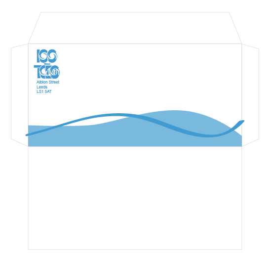
Envelope.
When creating my envelope, I got the measurements of a business envelope so that it is the same as the rest of them, I then tried to apply the same design of my letterhead to the envelope so that they were consistent. I started by using all of the information that I had on the letterhead of the head office of 100 Things To Do, but then I thought about it, and the information is on the inside, and there is no need for putting all of the information on again. I think that the simpler it is the more effective it will be, this is why I decided to chose the envelope with just the logo and patter on the bottom.

When creating the envelopes I only had A4 paper in the stock that I have chosen, therefore I had to print off the front and back separately and stick them together, luckily it worked well and looks good, but next time I will look into stock sizes, as I might not be as lucky next time. When designing the envelope I used the same pattern as the letterhead and business cards, his is so that I keep the brand consistent. Having a consistent brand shows that the business is also consistent which is something I want to have, but not only that, it looks good. As well as business cards and letterheads I have produced pens, they also follow the same style as the rest of the branding.


No comments:
Post a Comment