Developing my Print Publications.
I started designing by first getting an idea of what I wanted to go into all of my publications, and how I wanted them to look, this is so that I have some sort of guide to follow when I actually start the design.
Illustrations.
Researching into the information that I am going to be putting into the different publications in my pack, got me interested in the different types of binding I could do, and consider when making my own print pack. So I started to design small illustrations of each of the different binding methods that I think would be useful in my books.
Creating my Publications.
After researching what information should go in my publications, I started to make illustrations that could go by the side of the information. I have an idea to have all of the information about the subject on the right hand page so that you can initially read about it, then examples of what it is on the left hand page, so that you can see examples of it, and how it works.
This being said I now how I want it to be laid out, but I just need to establish a colour palette or pattern. I think that having different colours is important, especially in this publication, otherwise all of the pages would look very similar, as would the illustrations. Although I don't think having completely different colours would be a good thing, I think that it would look really tacky.
I think have two different colours in each publication will work really well, it could be a theme throughout the publications, it also means that the illustrations I design, can be more than just one colour black and white. I also think that each book should be a different colour to the one before that, this is something that I want to do, whilst trying to avoid it looking tacky and cheap.
Looking at the layouts of each of these pages, I think that the bottom layout works best, as it makes the colour not too overwhelming. It also allows the information page to have some colour without it being random and out of place, it balances out the double page spreads.
To make the front page different I think that I will have a vertical line on it, but make it so that its not against the edge, so that there is a small gap between the edge and the contents. I think that it gives the page more structure and makes it look more fitting.
Organising the illustrations to all fit on the examples page, without making it look imbalanced or cluttered was hard to do, especially as I had 10 different binding methods, this is why I got rid of one, because it fit a lot better. when drawing the illustrations I didn't think about the way that they would be presented, I just wanted to draw them, but when laying them out, I realised that they aren't all facing the same way. I tried organsing them the way that I drew them, but they didn't look right, so I had to turn them all so that they were facing the right way, this made the layout look more professional and organised.
I also think that the type on the first page in every book looks a bit boring, adding a colour to the outline of the type, gives it that little bit extra that it needs to brighten up the page.
Finding an appropriate layout for this page is very important as it is the only page where the examples are spread across both the left and right pages, which means I need to get the balance right between the two, the only way to do this is use the gridding system.
As well as getting the right balance on the example pages, I need to make sure that I am getting the right balance on the information page. With this I want to information to hold the same layout as the examples, although I don't want to clutter up the page too much. Having an orange sub heading means that I can establish the different between that and the information about the binding methods, it also makes it look better and less busy.
There is a lot of things in my stock publication that will need sticking in, everything has its own space provided, this is so that I know there is room, and so that I can use the grid system to work out where everything would go, whilst leaving the appropriate amount of space.
Most of the double page spreads in the publication have their own digital illustration or example of what the information is saying on the opposite side of the page, so that it is digitally done, and ready to be bound after printing.
Not realising this till after I have printed but the pink in the illustration is the wrong colour, this is something that I will have to change and reprint. These are also things that will need to be stuck into the publication, as if I laser cut or embossed onto the actual publication, it would ruin the information on the next page, and not look very effective. Although I will be printing the foiling and flocking straight into the publication.
After My Crit.
After my crit I went back through all of my publications that I printed, and pointed out all the gridding mistakes, so moved all of my things around so that the gridding system worked better. This made my designs look more sharp and quality, it is something I will always go back and check when designing.
Processes Used In My Publication.
Laser Cutting.
The laser cuts I did for my publication are quite hard to see in the images, but they worked really well. I couldn't decided which I wanted to put into my actual publication, do I took my laser cuts to the crit to ask my peers which they think would be more suited. The one I chose to use was the one everyone else said I should use too, it was most fitting with my publication, and was in the same style as the rest of my print finishes in my publications. Even though some of the other ones might have looked better individually, the one I chose looked better with my pack.
Embossing.
I wanted to include some embossing in my publication but I didn't want to use a copper plate, so I decided to use MDF and cut it out on the laser cutter. When I did this I didn't know which size MDF to cut out, so I chose one and it was the wrong size. I knew it was the wrong size because when I tried to use the emboss press on it, the press crushed my wood. This is something I have learnt from doing this brief, make sure you use a smaller depth of MDF than 6mm when trying to emboss. Although it crushed my wood, I laser cut two Emboss plates just in case, and was a lot more careful with the second one. I managed to get a few embosses that I like and looked good.
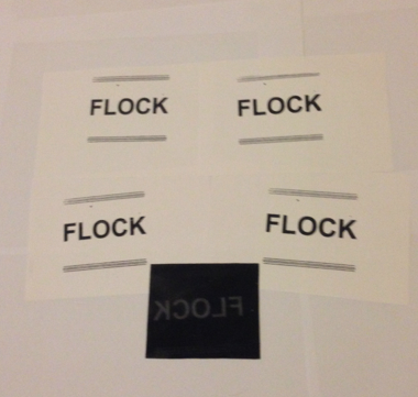
Foiling and Flocking.
I have researched all of the print methods I am going to use in my publications, I have also experimented with all the different methods of printing. I thought that I would still do further tests when I before printing directly into my publications. Even though I did testers, that all went well and looked good, I messed us the foiling page when putting it into my publication as I gave it a ghost. This is why I have had to stick a quality and clean version of my foiling into my publication, over the top of the failed foiling attempt.
I produced both black and white screen prints for the cover of my books, I did this because I wanted to see which would look best, and I found that although I like the white and a lot of other people did to, the black was more relevant and in keeping with the publications, therefore I went with the black, and saddle stitched the publications together.
The Final Publications.
The packaging I have made for my publications is just true grain, I want my books to be seen, but also be in a belly band to keep them together, therefore I thought that having true grain meant that they would be seen. I also thought that it could be a good protection for the books, as if anyone gets anything on it, it can just be wiped off.
If I had more time with my print books I would have created better packaging, and I would also have tried to create a hardback version of my print books, putting all of the publications into one and making a hard back copy. When I fist started to think about this brief, I thought that I would like to screen print the whole pack/manual, but the further I got into it, the less necessary I thought it would be to screen print the whole book. I also started to run out of time, so I wouldn't be able to screen print the whole book. If I were to do this again I would have organised my time better, although I am glad that I didn't screen print the whole book, as screen printing a whole book is something I really want to do, and I want it to be about a good topic, and be relevant to the topic, rather than just doing it for the sake of doing it.


No comments:
Post a Comment