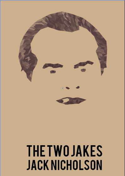
The Two Jakes.
We were given a Jack Nicholson film each, picked randomly from a hat, then had to create a movie poster using only two colours plus stock. I was given the film, The Two Jakes, this is a film I have never seen before so I decided to watch the film. After watching the film I then decided it would be a film I would never watch again. I started to look into research into the film and alternative film posters. Although I didn't enjoy the film, I thought it was quite boring, I don't think that everyone will think it's boring. When designing the poster I want it to portray Jack Nicholson as the main character and show his cheeky characteristics. I want to poster to be quite simple, and simply about the Character Jake, as that is all the film portrays to me, and I don't want o do any false advertising, I also think that posters that are quite simple have a stronger message.
Development.
I found a screen shot of Jack Nicholson in The Two Jakes, this picture showed clearly the character that he is, always smoking throughout the film. I have found many different designs for movie posters broken up images and using different colours to highlight different areas, this is also something I have used for a brief before but not as detailed or limited colours, so I thought that I would create the shapes using two colours only and different opacities.
I decided that I would start with the main features and work from there. I chose two colours that I thought would compliment the design and compliment each other, I think that these colours work really well together.
I am really happy with how it looks, using different opacities for different areas of the face shows the dimensions of the face.
I wanted to put a shadow on the background, although becasue I have used opacities, it changes the colour the actual face. Putting a white shape in front of the shadow means that the colour of the opacities remains the same, although I don't think that it works very well anyway.
I'm not sure that I want the illustration to be on plain white background, so using the colours that I have I have applied them to the back, but it just makes part of the illustrations disappear. I think that printing the design on an off white coloured stock would work better. Or maybe even a cream or sand colour.
I want the text to say Jack Nicholson as he is the main actor in the film, and also the name of the film itself. I have tried using different layouts of the type, and different fonts. Bebas and Century Gothic. I think that Bebas works well with this poster aesthetic.
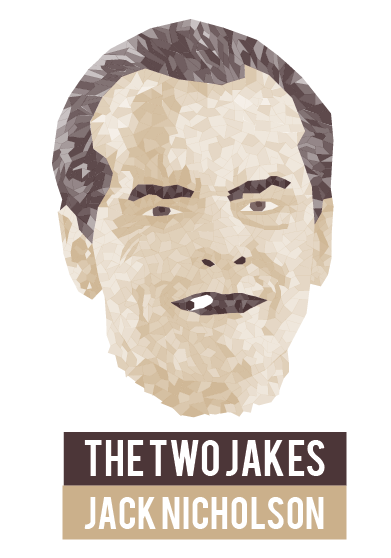
Mock up.
Evaluation.
If I were to do this brief again I would have prayed for a different film, or even a different actor, as I am not a fan of The Two Jakes. But as this wouldn't happen I would try look for some hidden meanings in the film, something that would entice people into wanting to watch the film to see what happen in it. I am really happy with my final poster design, I tried printing on different stocks and found that thin card that is sand colour works the best. Looking at all of the posters that my peers have done I have seen a massive range and think that they will all work really well together as a set.


No comments:
Post a Comment