For the brief Design for Web, I ave to create a website to do with greetings cards.
I started to look into the different things I could do to create a website about greetings cards, thinking about my audience, what it is I want to communicate and the content that I want to have on my site. this led me to think about the fact that I want to create my own hand crafted greetings cards, and if I create a website to sell cards, I can create all the different cards on my website.
I need to have five working pages for my website, one of which being my homepage, therefore I started to look into what I should include on my website as well as handcrafted cars. I thought about creating little notebooks and postcards as well as greetings cards, which could all consume pages, but then I don't know if notebooks will be related to greetings cards that much.
Looking into how the pages all link together can help to see how the pages are going to work, this will help me to know what I am going to design.
Doing this has made me see that I was trying to design for the product rather than the purpose, therefore I have decided that I am going to design my website around the occasions such as Birthdays, Valentines, Mothers Day, and Christmas rather than the products sold. Each of the occasions will sell the same products such as, ribbons cards, wrapping paper, and tags.

This is the way that the website is going to work, each page will have the same content on them, will link to a make it page, for the make it yourself cards, and each page will link to a buy page too, as everything will be available to buy.
Thinking more into the website and the content on the website, I think that it would be better to not include Mothers Days or Fathers Day, and maybe create a Make it Yourself page instead as I have found that the Martha Stewart website is very successful, showing the different gifts that could be made.
Thumbnails.

The Birthday, Christmas and Valentines Day pages will all be the same in aesthetics and the wireframes will all be the same, just changing the content and the images. This means that I can produce thumbnails for all three pages in one, the Make It Yourself will also be very similar to the seasonal pages. After researching lots of different websites, I have decided that I want mine to be very minimal and not cluttered with lots of advertising and information that my audience doesn't need.
This is the information that needs to be included on the website. If you select a product, there is a lot of information that needs to be included when selling the product.
 |
| Thinking of a name for the website. |
The Christmas/Birthdays/Valentines pages are all the same layout and will be the same measurements, and wire frames, it will also have the same coding, therefore I have only created one wire frame for all three, as they would all be the same.
The Do It Yourself page will also be very similar to the Christmas/Valentines/Birthdays but instead of the pages going down and continuing to scroll, it doesn't.
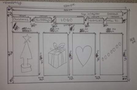
The home page is very simple with little information on it, just simple illustrations about each of the seasons.
When I started to do my wireframes, I wasn't sure why I was doing them, or how helpful they would be, but after doing them I can see that now I have the measurements that I need, and won't have to mess around with them when I am trying to code.


No comments:
Post a Comment