After doing some primary research and looking into other popular stationary shops I have found that thy all have collections of different things, such as a flower collection or a certain colour or seasonal. Therefore I thought about different things such as;
- Colour Scheme
- Animals
- Flowers
- Patterns
- Circles
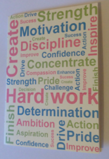
I started by finding motivational words then using the colour scheme I wanted place all of the words on a page to start looking into a notebook and how it would look printed on the stock I chose. I chose these three colours because I think that pastel colours work really well together, also I have some pastel coloured stocks that I think would look really good together. This is why I wanted to have something to print so that I can work from that, to see whether or not the colours work together.
This is one of the coloured stocks, which is green, although it is hard to see in this picture, it works quite well with the colours used. I think that I will definitely be using these colours for my collection.
This stock works the best, it is a creamy pastel colour, which compliments the colours used really well. This is why printing early is so important so you can see if and how it works on the stock you have chosen, before you start designing.
I decided to try out a few logos on a front cover of a notebook too to see how it would look as a brand. I decided to actually make these into books by binding them together so that I could see how it would actually work, also I needed to see which binding method I am going to use, and practicing it, as I haven't done a lot of binding before.
After printing a logo on the front of the mock notebook, I decided that I don't want the brand to be plastered all over the products, I think that the logo could be small and on the back of a product, but I don't want it to be too overwhelming. I also thought about the motivational type and decided that it still looked a bit serious, whereas I want my brand and products to be more fun and appealing to younger people who are trying to organise their lives, but do it in fashion.
I started to look at Penguins because they are my favourite animal, and I would enjoy creating a penguin collection and products. I started by drawing out a basic version of a Penguin, specifically this is a Chinstrap Penguin, which is my favourite of the many different species of Penguins.
I think have found that using felt on a notebook cover can look really good and bespoke, although when I made this I think that it looks a bit too plain, and I think that I need to stop focusing on the products for now, I should focus more on the brand, establish that and the products will follow.
Rather than looking at felt I decided to create the penguin on illustrator so that I have a digital version and maybe this would look better on the front over of a notebook.
Creating random products right now is not something I should be doing, I should be focusing on looking further into my target audience and finding out what they want. I also need look more into the branding and the business I am going to be creating as this will give me more of a direction of where I want to go with my products and the collection I am going to be creating.


No comments:
Post a Comment