The initial ideas we had for this brief were to work as a large group, this way we had more people, therefore would get more work done through the week. When planning how to do, How To...Make People Read More, as we all had different categories, we thought we would all assign different jobs. We started to brainstorm ideas which we could use for this brief;
We were all thinking of different ways which we could get people to read more. Coming to the conclusion we should start with helping children to read more, showing them the joys in reading, and making it fun for them. We were going to use the story The Wizard of Oz, and have it leading from the entrance of a school to their library with illustrations following the story, this will enable children to enjoy reading more, and show them where to go to do this. We then thought that we would just use quotes on walls outside leading to public libraries, also entrances in schools to their libraries. We would also create bookmarks that children would be attracted to.
When organising what people in the group should do for this brief, we decided to go with each of our strengths, therefore people who were better on illustrator could create the characters and people who are better on photoshop could do the photoshopping the images onto walls e.t.c. I was given the task to make the bookmarks. Everyone had something different to do, as Jasper was doing the spacial design, looking at where the quotes will go what what they will look like, Ana looked into the quotes and what they will say, Mel made the sticker charts and the stickers, and Danielle was creating the characters on illustrator, these are the characters she sent me;
Bookmarks;
Knowing that I had to create the bookmarks I started to research it thoroughly to find out which books to use, and what makes a good children's bookmark, why they are attracted to them and how I should apply that to my bookmarks. I also thought about have reading lists and reading levels on the bookmarks, so that when a child has finished one of the book on that list, they can check it off, this will engage the children more, it will give them something to do and look forward to when reading.
I looked at making the bookmark into a character so that the children will engage with it more. Looking at having information on the front and the back of the bookmark or just on the front. Also considering stock as there will be a check list on the bookmark for the children to tick off when they have read the book, therefore it can't be laminated.
I thought about having a small pouch on the back of the bookmark, something that can be removed from the bookmark and stuck to a wall by the side of the children's bed or something. This would work well as you would be able to fit more detail on the poster, it could have information graphics on it, to show children how to read. You could also fit more books on the poster, although it might be a bit fiddly, and the pouch may take up a lot of room, therefore making the bookmark useless.
After doing my research about the levels of reading, I made some mock ups of the front and back of a bookmark, showing the different books they can read. This gave me a basis of how to structure the bookmarks, and where things should go in each level.
When Danielle sent me the illustrations I used the heads from them to create the bookmarks, when doing this I had to remake the illustrations because our software wasn't compatible, so it was difficult to make it the same. I created a structure so that the heads are all the same size and the 'bodies' are all the same size too.
After creating the bookmarks I printed them off to see how the print quality was, and as I screen shot some of Danielle's illustrations then put bodies on them, it was clear that the bookmarks were pixelated and needed to be re-drawn, so that they are a better quality. Here are some images and evidence of how bad they came out as a print;
Depending on which animal the text is on, the colour of the text could change colour so that it is easier to see. Although when experimenting with different colours of text I found that white works best for all of them. I then printed them out to show the group and see what they thought about the bookmarks. When we were thinking about the application of the bookmarks, we thought that we would need a book stand. Danielle was making the holder for the bookmark, and we realised the holder would have to be massive because of the size of the bookmarks, therefore we decided as a group that the bookmarks could be smaller.
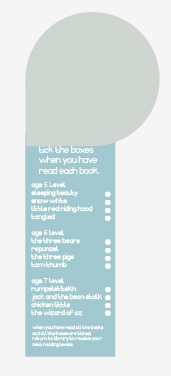
Going form the top size to the bottom. On the top bookmark there was room for all six different reading levels, whereas there isn't room on the bottom one. Because of this I thought that the way which we can see if the bookmarks are working or not, is by completing one bookmark by ticking all the boxes, then taking it back to the library to receive the next bookmark, with the next 3 levels on it. This means that there will be have room on the bookmark as there will only be three levels on each, also we can see if what we are doing is working.
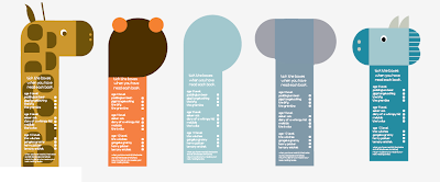
The white writing on the black bookmarks works really well as there is a high contrast between black and white. Each of the bookmarks has the lists of levels on the back, and the front simply shows the animal/character.
These are all of the backs of the bookmarks. Creating the backs of the bookmarks was more challenging than the front, as they are being double sided printed, therefore having the text in the right place is crucial. I also wanted to have consistency with the bookmarks, so having white text for all of them would keep that consistency.
The back of a bookmark levels 5 to 7.
The back of the bookmark level 8 to 10.
Both of the bookmarks look similar, by changing the colour of something like the text or changing the layout of the text will separate the two different leveled bookmarks. Although when experimenting with this I found that it was effective on some but not others, as I tried black text, but then there would have to be a white box around the text on the penguin as the penguin is black. Therefore as it looks better as white text, I will keep it like this for all of them, and when handing the next levels out at the library, people will just have to read the levels to check they are doing the right thing.
Having two options for seals, meant that we could chose which one looked better as a bookmark, we decided that the one with the grey heard would work better as a bookmark, less plain, but still simple enough for it to work well.
When changing the lengths and the shapes of the, I went from the top image to the bottom. When doing this I found it hard to change the shape of some of the different animals for example the giraffe. Therefore I decided to just put a white box over the bottom of it, as you can slightly see on this image. This did not work well, its doesn't look very professional, and it needs to be changed.
These are three of the bookmarks which have been redrawn on illustrator, they are a lot better quality on screen therefore will definitely be better when printed.
The finished bookmarks, front and back;
Posters;
Although it was Anna's job to come up with the quotes and put them into posters and do the designs for the wall murals, as we all had the same same quotes and the same illustrations of the characters. I decided to do some different layouts for them, also different situations that the characters were in.
Experimenting with posters;
This was used in the brief as one of the poster, it is trying to symbolise an adult of teacher telling children about reading and how good it is for them.


No comments:
Post a Comment