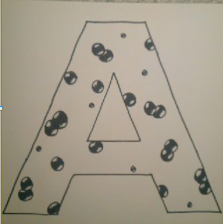
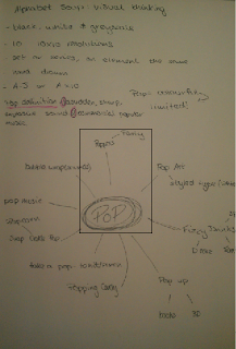
After doing this I decided to work with the concept of pop art, fizzy pop, a popping balloon and a pop styled type. I decided that I wanted to work inside a typeface and slightly adapt it rather than completely changing the typeface, therefore I decided to use Gill Sans so that its a simple standard font but has a large area to fill, so I can portray 'pop' better.
The first thing I think of when I think of 'pop' is fizzy pop to drink, therefore started looking at different ways which I could show liquid pop in a letter.
 |
| fizzy pop |
I then started thinking about using my letter form and adapting it to make it look like a pop styled font, like what I researched.
 |
| pop style |
I then looked at the idea of a balloon popping as I thought that it would show clearly popping.
 |
| popping balloon |
This was very simple, and thought it worked really well, it clearly shows something popping, and when people think of something popping they first think balloon, so I think this would work really well.
I also looked at using pop art, like Andy Warhol, using repetition and colors, although in this brief I can not use colors therefore use black, white and grey scale to show the change in color.
 |
| pop art |
I used images of a can and an apple just as an example of something I would put into it. I wouldn't use these objects in my letter forms if I were to use this idea, I would use something more relevant such as a balloon popping of something.
The brief said that it could be a set or series, but we also got told for them to all be different with an element which is the same running through. So I thought about using the balloon popping idea and doing a series, so that it shows the stages of which a balloon would pop.
 |
| popping balloon |
Looking at pop art I saw a lot of negatives, which is what I think gives the effect of pop, and when thinking about it I am going to use block colors as they will stand out more to give a popping effect as it will be bold. I also experimented with different materials and medias.
 |
| pencil on cartridge paper |
 |
| black fine liner on white card |
I decided to use black fine liner on cartridge paper, as the pen smudges on the card, therefore it would look a lot better and neater on the cartridge paper.
When choosing what I should do for my set of 10 letter forms, I decided to choose 5 different ideas and examples of pop, and have two of each, one being the negative of the other. MY final letters consisted of fizzy pop, balloon popping, pop art, pop styled type and an ice pop.
 |
| fizzy pop negatives |
 |
| pop art negatives |
 |
| pop style type negatives |
 |
| ice pop negatives |
 |
| popping balloon negatives |
These were my final 10 letter forms, the majority of my letters show pop quite clearly so they will work very effectively.
Evaluation;
After the crit I found that my letters were not chosen in the top five as demonstrating their word, although the word 'pop' wasn't chosen for any groups, as it is hard to portray without colour in my opinion. I would therefore look further into how to communicate the word pop.
If I had more time on this brief I would have focused more on the successful letter form such as pop art negatives;
 |
| pop art negatives |
Overall in the amount of time I had, I think that I did all I could to communicate the word 'pop', although I would have preferred more time.

No comments:
Post a Comment