Wednesday, 23 April 2014

Module Evaluation


Evaluation.

1.  What skills have you developed through this module and how effectively do you think you have applied them?
The main skill I have learnt through this module is in collaborative. My partner Emily taught me how to mock things up on Photoshop. It is something I have never been able to do, as Photoshop isn’t one of my strengths. After teaching me this I was able to apply it to the rest of my briefs for Responsive, but also for other modules. This skill helped me to show my clients a mock up of what the products would look like in context, which helped to communicate what the design would look like. As well as mocking up I have also found that my skills on Photoshop have developed, and I am a lot more confident using it. I have also developed my illustrations further and have found that I really enjoy creating characters and avatars for people, and it is something that I want to do more of. I applied this skill as I have done a couple of briefs during this module for characters and avatar designs, and have found that I have got better through this module.

2. What approaches to/methods of design production have you developed and how have they informed your design development process?
I have done a range of different printing methods throughout this module. Creating screen-printed posters for The Pink Teapot worked really well and it is the most amounts of coloured layers I have had to print. The prints were successful as customers in the café bought a few of them, which was a huge motivator when doing my briefs. This made me think that I should try doing more screen prints in my design, as it was successful. I have also printed commercially for two different briefs for business cards, also some menu’s for The Pink Teapot. This was a really easy way to print and the result looked really clear and professional, this is something I will definitely consider using again when it’s appropriate. 

3. What strengths can you identify in your work and how have/will you capitalise on these?
The strengths I have in my work is that I don’t just go with the obvious ideas and do the same thing over again, I try to think outside the box and push boundaries of the brief. I think that this will work well for me in the future as if I am doing competition briefs or competing with other people to get a job, at least my work will be different and stand out. I have found that I really enjoy character design and making avatars, this is something I will definitely look out for when I am doing briefs in the future. Through this module I have found that I am a lot better at organising my time than I thought I was, also the structure of this module worked better for me as I felt that I was free to work at my own pace, and do the briefs around different deadlines.

4. What weaknesses can you identify in your work and how will you address these in the future?
The weaknesses I have addressed in my work is creating design boards, it is something that I have got better at throughout this module. But I still feel that I need to improve my design boards, especially when it comes to submitting them to competition briefs. In the future I will leave myself more time to do the design boards for competition briefs, as they are really important. I think that especially my Cath Kidston briefs, I could have done a lot better for my submission to YCN. Another weakness I found was that some of the smaller competitions briefs I entered, I rushed and I’m not proud of them, for example my hand drawn type valentine’s cards. I rushed this brief and really regret that as greetings cards are something I really enjoy designing, and I wasn’t happy with what I submitted. In the future I will take more time to look through my designs before submitting, and not submit if I’m not happy with them.

5. Identify five things that you will do differently next time and what do you expect to gain from doing these?
1. Take more time and care over design boards, as they are really important. I think that this will make my design stronger if it is communicated better.
2. Next time I will make sure that all of my mock-ups are of a good quality. I have got stronger with mocking up designs, and I think that it is a really good skill to have.
3. Organise my time better at the start of the module. If I would have tried as hard as I tried at the start of this module, I would have had more of a range of briefs and would have got more done, this is definitely something I will do in the future.
4. As I learnt how to mock up half way through the module I should have doe mock-ups for everything for their individual deadlines. I think that this will give the clients or judges a better idea of what the design will look like in context.
5. Every module evaluation I say that I will blog as I go. I have got better during this module as there is a completely different structure to the module, but I still think that I should blog more as I go. This will make me blog about it when its fresh in my mind, it will also not hinder my design in the future when I will have to blog all my work.

6.How would you grade yourself on the following areas:
(please indicate using an ‘x’) 

5= excellent, 4 = very good, 3 = good, 2 = average, 1 = poor

1
2
3
4
5
Attendance


x
Punctuality


x
Motivation


x

Commitment


x

Quantity of work produced


x

Quality of work produced


x

Contribution to the group


x

The evaluation of your work is an important part of the assessment criteria and represents a percentage of the overall grade. It is essential that you give yourself enough time to complete your written evaluation fully and with appropriate depth and level of self-reflection. If you have any questions relating to the self evaluation process speak to a member of staff as soon as possible.

Project Report

Summative Evaluation

Evaluation.
When I started this module, I was initially quite worried about how I would do a minimum of 5 individual briefs, and more importantly, how I would manage the collaborative brief. I think that having briefs set for you allows you to have an excuse if anything goes wrong by saying its not really your thing. Although choosing our own brief would put more pressure on them.

At the start of the module the pressure of choosing our own briefs was very high, although I found that when I started actually doing the briefs I really enjoyed the fact that I was able to choose what I wanted to do. Through this module I wanted to do a range of larger and smaller briefs, and I think I did that well as I have larger and smaller briefs for competitions and live briefs. I also wanted to take advantage of the fact that I could choose my own briefs, and do more of the kind of briefs I enjoy doing.

The main individual brief I started on, I decided to explore the boundaries of the brief, and see how far I could push it without changing the brief completely. I really enjoyed The Body Shop brief as I think that going from a different angle made my design different and stand out. The Body Shop is a company I really like, and it was really good designing for a company that is interested in helping people and being animal friendly. I also already know a lot about The Body Shop as I do shop there, therefore I felt that I had an advantage when approaching this brief.

This module has helped me to develop my skills and develop as a designer. I have found more of what I am interested in, as I previously thought that I would go into packaging, but I have found that I am more interested in illustrating. I have also gained experience with working with clients, and discovering that every client is different and each client has different needs and work in different ways.

Responsive has helped me with my time management and organization. Each brief has a different deadline, therefore I was working to each of the separate deadlines, where as with uni briefs the deadlines aren’t as official and I usually have lots to do for the module deadline, whereas for this deadline I have been very prepared and ready for it. I have also enjoyed being able to just pick up another brief when I am stuck with the one I am currently doing for a break, especially if it is a small short brief, giving me a refreshing break from the larger briefs.

There are a few briefs that I have done during responsive that I am not proud of, but this module allowed me to learn from this from my mistakes, and move forward when it comes to the next brief. I have enjoyed being in control of my own workload and doing the brief s in my own time/ Particularly liked choosing which briefs I wanted to do, and when I could do them. I have also taken advantage of doing live briefs, as people have asked me to do work for them in the past but because f this course I haven’t found time. But having a Responsive module allowed me to do both at the same time.

Doing the collaborative brief was my biggest fear with this module as I am not a fan of working in a group. I was also worried about choosing a partner and whether I would have someone to go with. Although I was very surprised with my partnership as I think that it worked really well. We both had different skills, which meant I could focus on the bits I enjoyed whilst she focused on the aspects that she enjoys. The outcomes for my collaborative brief I was really happy with and I think that working as a collaborative partnership was very successful for us, as I learnt that group work could sometimes work.

Overall I have really enjoyed this module and think that it has been my best and favorite module through the whole course. It has developed me as a designer and taught me more about working with live briefs. The structure of this module has meant that I was able to do the briefs I wanted, when I wanted to do them, which has given me more freedom and allowed me to explore what kind of a designer I am.

Oasis Collaborative Design Boards

Oasis Individual Design Boards

Hall's Business Card Design Boards

Surface Pattern Design Boards

Avatar Design Boards

The Pink Teapot Design Boards

Cath Kidston Design Boards

Valentines Cards Design Boards

The Body Shop Design Boards

Monday, 21 April 2014

The Two Jakes Poster Design

The Two Jakes. 
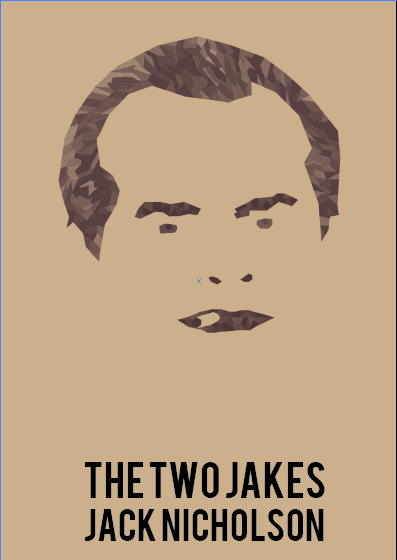
We were given a Jack Nicholson film each, picked randomly from a hat, then had to create a movie poster using only two colours plus stock. I was given the film, The Two Jakes, this is a film I have never seen before so I decided to watch the film. After watching the film I then decided it would be a film I would never watch again. I started to look into research into the film and alternative film posters. Although I didn't enjoy the film, I thought it was quite boring, I don't think that everyone will think it's boring. When designing the poster I want it to portray Jack Nicholson as the main character and show his cheeky characteristics. I want to poster to be quite simple, and simply about the Character Jake, as that is all the film portrays to me, and I don't want o do any false advertising, I also think that posters that are quite simple have a stronger message.

Development.
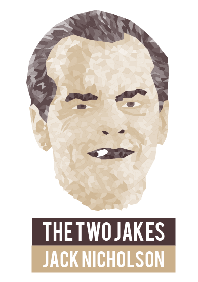
I found a screen shot of Jack Nicholson in The Two Jakes, this picture showed clearly the character that he is, always smoking throughout the film. I have found many different designs for movie posters broken up images and using different colours to highlight different areas, this is also something I have used for a brief before but not as detailed or limited colours, so I thought that I would create the shapes using two colours only and different opacities.


I decided that I would start with the main features and work from there. I chose two colours that I thought would compliment the design and compliment each other, I think that these colours work really well together.
I am really happy with how it looks, using different opacities for different areas of the face shows the dimensions of the face.

I wanted to put a shadow on the background, although becasue I have used opacities, it changes the colour the actual face. Putting a white shape in front of the shadow means that the colour of the opacities remains the same, although I don't think that it works very well anyway.

I'm not sure that I want the illustration to be on plain white background, so using the colours that I have I have applied them to the back, but it just makes part of the illustrations disappear. I think that printing the design on an off white coloured stock would work better. Or maybe even a cream or sand colour.

I want the text to say Jack Nicholson as he is the main actor in the film, and also the name of the film itself. I have tried using different layouts of the type, and different fonts. Bebas and Century Gothic. I think that Bebas works well with this poster aesthetic. 

Mock up.

Evaluation.
If I were to do this brief again I would have prayed for a different film, or even a different actor, as I am not a fan of The Two Jakes. But as this wouldn't happen I would try look for some hidden meanings in the film, something that would entice people into wanting to watch the film to see what happen in it. I am really happy with my final poster design, I tried printing on different stocks and found that thin card that is sand colour works the best. Looking at all of the posters that my peers have done I have seen a massive range and think that they will all work really well together as a set.

Sunday, 6 April 2014

Tom Hall's Business Cards

Hall Plumbers Business Cards.
The client Tom Hall wanted some business cards as he is a self employed plumber. The brief he gave me was simple. He wanted business cards designed using his name, occupation and number. I asked him about a colour scheme or a business name, but he didn't have any ideas and said 'whatever you think is best'. This brief is very open therefore as long as it had his name, occupation and number on it, I was free to do what I liked. I started to think about names for the business, and came up with a few. Asking the client what their opinion is on them and which one her would choose, he agreed on 'Hall Plumbers'.

The colour theme I wanted to go for with the business cards are 'water' colours, different blues. This will keep the business cards consistent with other plumbers business cards, as when people see the blue it will automatically remind them of water, which is related to plumbers. Going onto adobe kuler meant that I can quickly access different colour schemes and see what they look like together. This is the colour scheme I am using for business cards, although only three of them.

I have created a detailed water droplet using two colours from my colour scheme, and different opacities. This droplet will be used throughout the business cards, it will be used in the logo and as an icon for the business.

The business cards.
I think that using a collection of the droplet will look like water falling down, like a leak or soemthing that would need repairing by a plumber.

Entering the clients information I found that I would definitely need to include a business name. I have also decided to use an opacity of the blue as the background colour on the stock, this is to enhance the idea of water.

Using the typeface Century Gothic, I created outlines and using the pen tool I created what looks like puddles in the bowls of some of the letters, and included the droplet in the business name.

Trying out different colours of the type and background allowed me to see that it would be better to have white type on a coloured background.

I started to try out many different layouts, looking for which one will look the most effective and aesthetically pleasing.

After speaking to the client and showing him the ideas that I have had, and the progress I have made, he said that he really liked the name of the business, and the aesthetic of the logo. He also preferred the layout where the type is left aligned and wants to go forward with something like that. He also wanted me to think of a slogan that could be used.

For the logo I have used Century Gothic so decided to change the type from Arial to Century Gothic, but I think it would look better to have a different typeface for the information than the logo. I decided to use Helvetica, as the client wanted it to look quite modern. Not knowing what a serif typeface was, he said he wanted it very minimal, therefore I thought that a sans serif typeface would be appropriate for these business cards. 'Keep Calm and Call Hall' is the slogan that I thought would work well for a plumbing business, as if something goes wrong all the customers would have to do is 'Call Hall'.

As the client didn't really know what they wanted I decided to create many similar layouts to what he asked for. I used different colours and different backgrounds. Thinking about what he asked me for, I think that the designs with lots of droplets on the back of the business cards are a bit busy. He asked for something simple, which makes me think that the single droplet would be better.

I showed these designs to Tom so that he could choose the colours of the business cards.

He decided that these would be better for him as he thought that the lighter blue looked 'a bit too feminine' for him. I do agree that they the darker blue is the designs he should choose, and they would suit him better.


I mocked up both of the designs on Photoshop so that he could see what they would look like, this made it more clear which of the designs he preferred. I have sent him the files and he will be getting them printed, this is another reason why I decided to mock them up, as I wont see them professionally printed. Although I have printed them out to show the client, the finish wasn't great from my printer, and will look better being printed professionally.

Evaluation.
I have enjoyed doing this brief as it was quite a quick and small brief, but wasn't very specific so I was able to do what I wanted to do for the business cards. I suggested that I could design him some letterheads or invoices but he said that he didn't think he would need them he just wanted the business cards. If I were to do this again I think that I may have tried to do something more creative and different to see if the client would like it. Although he did say that he wanted a simple business card, so that may have been a waste of time. Overall I am happy with these business cards, and am pleased that the client Tom Hall was also happy with them.

Thursday, 3 April 2014

Tigerprint - Black and White Surface Pattern

Tigerprint Black and White Surface Pattern.
I have already done a Tigerprint brief for Marks and Spencers, but I wasn't very happy with the outcome, I think I could have done it a lot better. Therefore I am going to do another Tigerprint brief that I will be happy with.

The Brief.
This month we want you to focus on black and white surface pattern. We would like you to design a surface pattern for a male or female recipient that could be used across a range of our everyday products including:
Gift bags, wrapping paper, stationery products or greeting cards.
The brief is open, so get back to basics and think about how the pattern is generated. Explore different techniques and formats, and really experiment with the elements that make up your pattern. Think about how different lines, marks and patterns can be created and applied. Look at fashion and homeware trends for inspiration.

There are many different elements that they have asked for, most of them I would be interested in doing. I think that I am going to focus on Geometric and Abstract patterns. The design must be in just black and white, therefore I think that using simple shapes could be a strong design. 

I am wanting the pattern to look retro in this design, an endless swirl as if the circle keeps going. creating a black outer circle with a smaller white circle in the middle is how I have made this effect.

I decided to make a pattern from the shapes I made, then create a repeat pattern showing how it would work if it were to be used for a surface print.

This is the first final surface pattern I have produced for this brief, and I am happy with it.
For the next black and white patter I though I would do the same sort of effect but use a rectangle instead of a circle.


Creating a basic pattern from this shape allowed me to create a repeat pattern to show how it would work as a repeat pattern.


This is the second surface print.

I used the same process for the third brief. Keeping the theme as shapes means that the print will all work together, and will have continuity if they were to be chosen.

Again I have used the same structure and theme throughout all of my black and white surface pattern. I am happy with the prints and think that they all work really well together.

Final Patterns.
The four surface patterns work well together as they all have a very similar theme. For all of them I have used a basic black and white shapes getting smaller and smaller so that it looks like they keep going, like a tunnel. Then creating a patterns using that shape at different sizes, then repeating it to create the surface pattern, this is why they all work well together, and would work well as a range of products.

Mock Ups.
The brief said that the pattern should be able to work on greetings cards, gift bags, tags or stationary. Therefore I decided that if I mock each of the patterns onto come cards, gift bags and tags, this is so that I can show that they will work on each of the different products that Marks and Spencers sells.

I started with the greetings cards, trying out two of the patterns I have designed. I think that the patterns work well on cards, I think that they are targeted at both males and females. This is what I like about geometric shapes and patterns, most of the time they don't have a specific gender for the audience, which is what is good about just using black and white, with no colour, it is suitable for men and women.

I then decided that I would mock the patterns onto some gift bags. I think that putting all of the designs onto the bags looks good, and they all work well together.

I have only put two of the four patterns onto the gift tags, because I think showing more examples of the gift tags would be too much, especially if I show all of my mock ups together.

Evaluation.
This was a quick brief, which I have enjoyed doing a lot. Being given limited colours, just black and white, meant that I could purely focus on the pattern itself. The brief suggested guidelines for the surface patterns which was what gave me the ideas for my patterns. I chose this brief because I thought that it would be a quick turn around brief, which will give me a break and do something new and different to my larger briefs.